 PledgeBox
Crowdfunding Campaign Design That Converts in 2026
Master crowdfunding campaign design with proven layout, messaging, reward tier, and post-pledge strategies. Build pages that convert and surveys that scale.

Master crowdfunding campaign design with proven layout, messaging, reward tier, and post-pledge strategies. Build pages that convert and surveys that scale.
You're probably staring at a draft campaign page right now that looks polished enough to launch. The renders are clean. The headline sounds smart. The reward tiers exist. And yet you still have that nagging feeling that the page isn't doing enough work.
That feeling is usually correct.
Most first-time creators treat crowdfunding campaign design like brand presentation. Experienced creators treat it like conversion architecture. The difference matters because on Kickstarter, fewer than half of launched projects reach goal. Kickstarter reportedly saw 670,058 launched projects, $8.97 billion pledged, and a 42.38% overall success rate, with the Design category at 44.14% according to this crowdfunding statistics summary. That's a brutal reminder that a good product isn't enough. Your page has to earn trust fast, guide choice cleanly, and protect margin after the pledge.
The bigger mistake is stopping your design thinking at the campaign page. A backer doesn't experience your launch as two separate systems. They experience one journey: discover the campaign, decide to trust you, choose a tier, then complete choices later around shipping, variants, add-ons, and taxes. If the survey is clumsy, the campaign design was incomplete.
A hardware founder once showed me a campaign page that looked expensive. Sharp photography, beautiful prototype, competent copy, slick video. The campaign still stalled at 38% of goal. The product wasn't the obvious problem. The page didn't answer the questions a stranger asks in the first few seconds.
That's the first hard lesson in crowdfunding campaign design. A page isn't a brochure. It's a funnel. Every block either moves a visitor forward or gives them a quiet reason to leave.
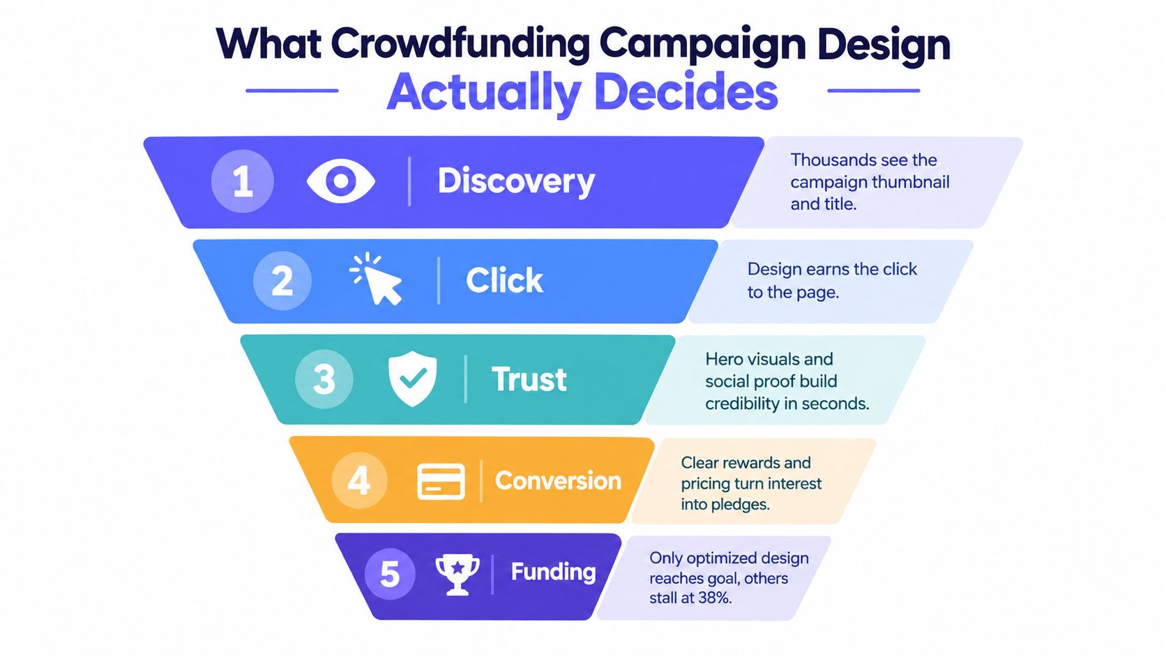
The page decides whether a stranger understands the offer in under ten seconds. If your headline names the product but hides the benefit, people bounce before they even scroll.
It decides whether the reward ladder pulls pledge value upward or traps backers in the cheapest option. Many pages look organized but still make the buying decision harder than it needs to be.
It decides whether trust wins against hesitation. A founder may know the prototype is real, the supply chain is lined up, and the timeline is sensible. The backer doesn't know any of that unless the page proves it.
Historical research backs up how much these design choices matter. A peer-reviewed study on crowdfunding project design focused on how entrepreneurs should choose the product menu and funding target, and related academic guidance found that 81% of failed campaigns achieved less than 20% of their funding goal according to the Wiley paper on crowdfunding design. In plain English, bad setup usually shows up early.
Practical rule: If your campaign page can't create trust quickly, your ad spend, email list, and launch-day traffic won't save it.
That's why teams that care about execution borrow ideas from broader campaign operations best practices. They don't separate messaging, conversion, and handoff. They design the whole path.
The strongest campaign pages aren't artistic collages. They're structured selling environments. Each section has one job, and when a section tries to do three jobs at once, conversion drops.
Start at the top.
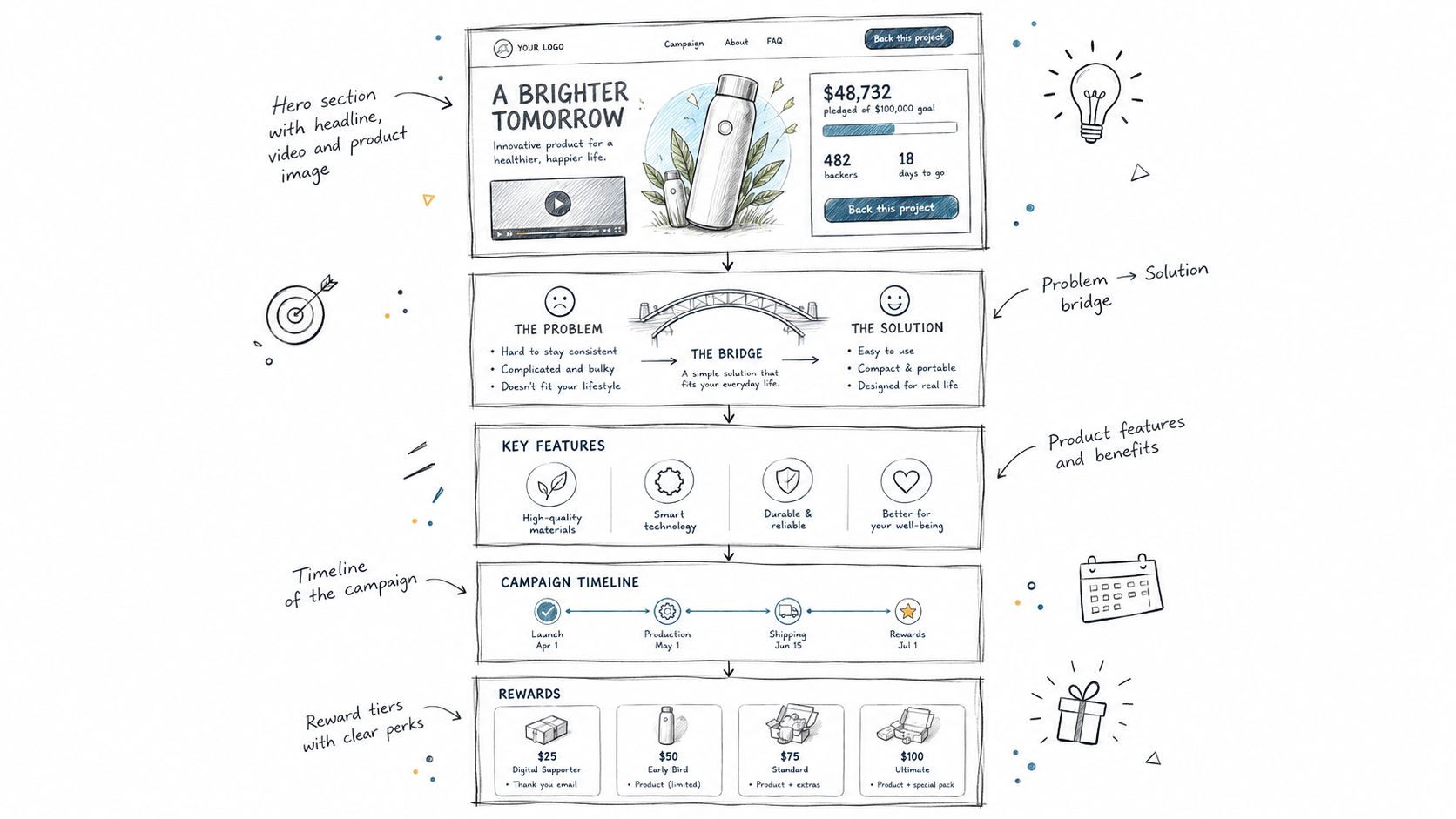
Your hero block has one job: explain the offer before the visitor starts interpreting it wrong. That means a clear headline, a plain-language subhead, a primary image that shows the product in use, and a video visible above the fold.
Then comes the problem-to-solution bridge. Don't jump straight into features. Name the frustration first, then show how the product changes the user's situation. If you skip that step, your feature list reads like specs without context.
A social proof bar belongs early. Press logos, creator history, prototype credibility, community signs, or visible engagement cues all help lower resistance. A large literature review found that goal and duration generally reduce success probability, while reward design and team size tend to help, and soft signals such as platform endorsements, likes, shares, media coverage, and FAQs are associated with higher success according to the review of crowdfunding success factors.
For additional page structure ideas, I like practical references on landing page conversion optimization tips, especially when creators are too close to their own copy and need to simplify.
The middle of the page should do the heavy lifting. You show feature proof, compare against incumbent options, and present the reward grid. Good mid-page design reduces cognitive load. Bad mid-page design creates a scavenger hunt.
A useful companion resource is this set of Kickstarter campaign page design tips, especially for creators trying to tighten the order and pacing of sections before launch.
A short breakdown helps:
Here's a solid visual walkthrough to study before revising your own page:
The lower page isn't filler. It's where serious buyers look for reasons not to back.
The FAQ often does more conversion work than the headline because it meets people at the exact moment they start objecting.
Your FAQ should answer shipping timing, compatibility, sizing or variants, refund expectations, manufacturing status, and what happens after the campaign. Then add a risk and transparency block that sounds like a founder speaking plainly, not a lawyer hiding behind fog. Finish with practical footer details: shipping policy, contact path, and basic terms.
Reward tiers aren't just pricing. They are behavioral design. They shape average pledge, fulfillment complexity, and how painful your survey becomes later.
The common beginner move is either too many messy tiers or too few blunt ones. Both can hurt you. A deep ladder gives more ways to spend, but every extra branch can create shipping exceptions, variant confusion, and support load. A very shallow ladder keeps operations simple, but it may leave money on the table if committed backers have nowhere to go except the base tier.
Your second tier should be the obvious buy. Not the cheapest one. Not the prestige tier. The obvious one.
That second tier usually works because it creates contrast. The first tier establishes entry. The second feels like the sensible value. Higher tiers then serve either bundle economics or collector psychology.
| Reward Tier Structure Comparison | Typical Tier Count | Avg. Pledge Lift | Margin Risk | Best For |
|---|---|---|---|---|
| Shallow ladder | Low | Qualitatively lower upside | Lower | Simple products, few variants |
| Balanced ladder | Medium | Better upsell room | Moderate | Most hardware and tabletop campaigns |
| Deep ladder | High | Can lift pledge value when clear | Higher | Accessory-heavy campaigns with strong ops |
No precise lift belongs in this table because that depends on category, audience, and offer quality. What matters is the trade-off.
Early-bird pricing creates urgency and can help launch-day velocity. It can also train backers to anchor on your lowest margin offer. Evergreen pricing is calmer. It preserves margin and usually simplifies survey cleanup because fewer people arrive expecting special treatment.
Use early-birds when they help a real launch plan. Don't use them because they feel like standard Kickstarter theater.
If you're planning your structure from scratch, this guide on how to plan your crowdfunding rewards is a useful planning reference.
Margin check: A tier isn't good because it looks persuasive on the page. It's good if you can fulfill it cleanly without creating a support nightmare.
Add-ons deserve the same discipline. Accessories should feel attractive on their own and still make bundle tiers look efficient. If an add-on undercuts your bundle logic, buyers notice.
The top of your page has to do emotional work and evidentiary work at the same time. Many creators manage one and miss the other.
A glossy studio render can make the product look premium. It can also make the campaign feel speculative if nothing else grounds it in reality. Backers don't just want to admire the product. They want to believe you can deliver it.
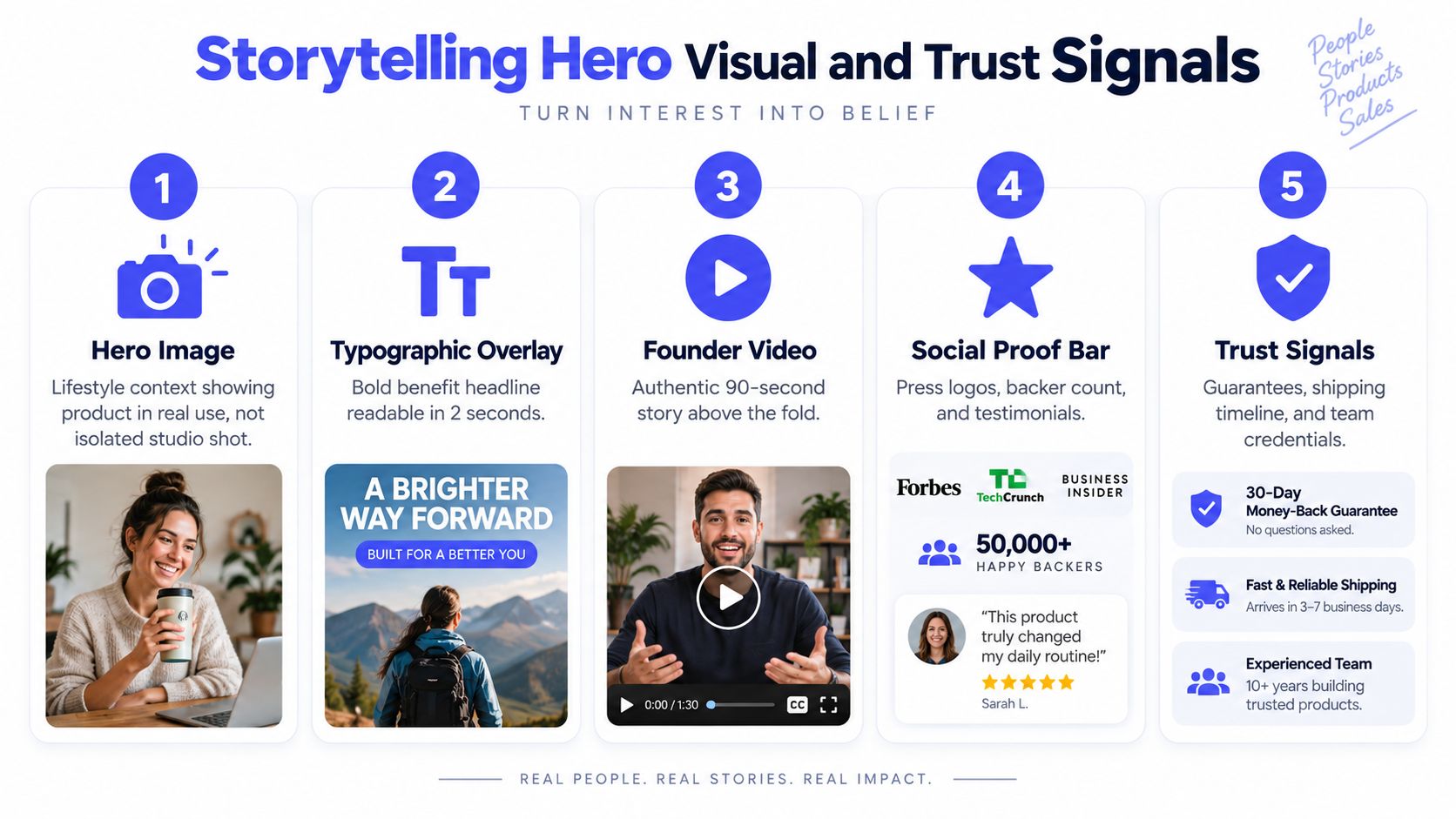
The best hero images usually combine three elements: the object, the use case, and the promised outcome. Put the product in the environment where it earns its value. Then overlay a headline that can be read in a quick glance.
A lifestyle image without product clarity becomes mood. A packshot without context becomes catalog. You need both.
A strong top-of-page video often follows a simple three-act script:
Trust usually comes from stacking several modest signals, not from one dramatic claim. Use a combination of creator credentials, prototype photos, manufacturing status, press mentions if you have them, and a realistic timeline.
Then build an FAQ that deals with the questions buyers ask:
The Risks and Challenges section works best when it sounds candid. If tooling is still in progress, say so. If shipping complexity is category-specific, say that too.
Testimonials can help. They rarely replace operational credibility. For physical product campaigns, a factory-floor photo or prototype-in-hand shot often does more than generic praise.
Post-campaign design is where many creators accidentally give back the gains they fought for during launch. The difference usually comes down to the pledge manager model you choose.
Kickstarter's pledge manager is included with no additional upfront cost, and Kickstarter says it deducts its usual fees from payments made within the pledge manager. Kickstarter also says the backer survey is used to collect addresses, reward preferences, and other fulfillment information on its pledge manager documentation. That's useful, but the operating model matters.
A marketplace-style pledge manager behaves more like a controlled extension of the campaign. Choice is narrower. The system stays close to the original pledge structure.
A storefront-style pledge manager treats the survey like a checkout environment. Backers can often revise choices more flexibly, select variants, add multiple items, and move through a flow that feels more like buying from a store.
PledgeBox's own comparison says Kickstarter pledge manager is like Amazon and PledgeBox pledge manager is like Shopify in its review of Kickstarter's pledge manager. That's a useful shorthand. Amazon-style flows are constrained and marketplace-like. Shopify-style flows give the creator more control over how backers configure and expand orders.
| Marketplace vs Storefront Pledge Management | Marketplace Pledge Manager | Storefront Pledge Manager |
|---|---|---|
| Reward changes | More limited | More flexible |
| Multi-item add-ons | Simpler but narrower | Better suited to richer carts |
| Variant configuration | Basic | Stronger for option logic |
| Backer experience | Platform-style | Brand-controlled checkout feel |
| Margin recovery | More constrained | Better suited to upsells and late pledges |
Kickstarter's support FAQ says that if a creator charges shipping while the campaign is live, they cannot use the pledge manager. The same FAQ also says Kickstarter collects the same fees on shipping and additional add-on funds raised through the pledge manager as on campaign pledges, while taxes raised through the pledge manager are not subject to fees according to the Kickstarter pledge manager FAQ.
That's why physical product teams should think beyond “Can this collect addresses?” The key question is whether the system helps you manage shipping recalculation, variants, VAT, and post-campaign revenue without turning the survey into manual cleanup.
Most campaign pages fail financially before they fail publicly. The page may fund. The project can still become painful if the unit economics were soft from the start.
Your pricing model needs to survive at baseline funding, not only in the optimistic scenario. Independent analysis published by PledgeBox argues that stronger campaigns now model the downside at 100% funded and treat the page as risk removal, not just storytelling. That same analysis also argues that campaigns increasingly function as market-validation and pre-sale engines, which makes clean survey design and data capture more important after funding. You can read that framing in this late pledge analysis.
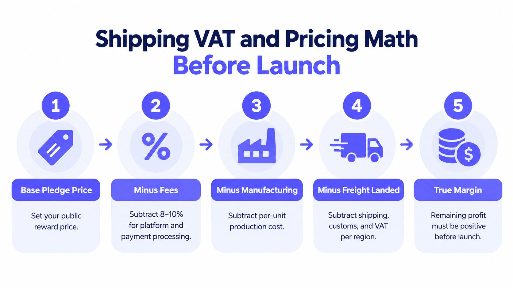
Start with your public pledge price. Subtract platform and payment fees. Then subtract manufacturing cost, freight, packaging, and regional delivery assumptions. If your heaviest bundle breaks the shipping model, your campaign page is advertising a problem you'll have to pay for later.
Don't bury VAT and tax questions until after funding. If you expect EU backers, plan the collection method before launch. If your rewards need region-based shipping differences or customs prep, price around that reality early.
One point creators often miss: PledgeBox is free to send the backer survey and only charge 3% of upsell if there's any. Its pricing page says there are no setup, campaign, or per-backer fees, and that the 3% applies to revenue collected through the survey, including add-ons, shipping fees, and taxes/VAT on the PledgeBox pricing page. That fee structure is different from charging a fee on your original base pledge inside the live campaign.
Survey design affects conversion too. Independent coverage notes that backers now expect campaign pages to behave like mobile-optimized product pages, and PledgeBox's survey design article points to research that visibility of completion status can increase willingness to continue engaging with a crowdfunding flow in its discussion of backer survey design best practices.
That matters because a mobile backer who can't easily finish variant choice, address confirmation, or add-on selection often turns into support debt instead of revenue.
For tax planning specifics, creators should also review VAT tax compliance guidance before pricing international rewards.
Most campaigns don't lose momentum because of one dramatic mistake. They lose it because the sequence is sloppy. The page, the launch window, stretch goals, and the survey handoff weren't designed as one system.
A realistic sequence starts weeks before launch, when you're still locking message hierarchy and collecting emails. If the signup page promises one thing and the live page emphasizes another, your first traffic spike lands on mismatched expectations.
Two to four weeks before launch, lock the hero message, reward structure, and FAQ topics. This is also when you should decide whether early-birds are real or whether evergreen pricing better fits your margins.
Launch week is for concentration, not improvisation. Your page should already contain the logic for the first buying decision. If you're rewriting major blocks after going live, you're spending precious momentum correcting preventable confusion.
Creators often treat the survey as an admin task they'll figure out later. That's backwards. If you know you'll need late pledges, variant logic, shipping collection, or accessory upsells, those decisions should shape campaign design before launch.
Sequence insight: The best post-campaign operations usually look boring from the outside because the team made the hard decisions early.
If you want a useful outside perspective on rollout planning and launch coordination, Genpire's launch support is worth reviewing. Not because you need another vendor by default, but because launch support checklists often reveal where your own sequence is still vague.
A creator can lose a week making the page prettier while conversion problems stay untouched. The better use of that time is to fix the points where a backer hesitates, picks the wrong tier, or reaches the survey and decides the whole purchase suddenly feels harder.
Start with the parts that change buying behavior on the campaign page.
Rewrite the hero line
Your headline should answer a first-time visitor's first question: what is this, and why should I care? Product names rarely do that job alone. A strong hero line works like the label on a store shelf. It helps people classify the offer fast enough to keep reading.
Rebuild the reward ladder around one clear default
The second or middle tier often carries the business. Make that tier easy to justify in one sentence. If a backer cannot quickly explain why that option is the sensible buy, your tier structure is asking them to do pricing analysis you should have done for them.
Move repeated objections onto the page
Check comments, emails, DMs, and preview feedback. Questions about timing, compatibility, materials, region availability, or shipping are not side conversations. They are conversion blockers. If the same confusion shows up more than once, answer it where the buying decision happens.
Then fix the places where revenue slips after the pledge.
The practical test is simple. A good campaign design does more than earn the initial pledge. It also makes the survey easy to complete, gives add-ons a natural place to sell, and protects margin once late pledges begin. That is the difference between a page that converts and a campaign system that keeps working after funding ends.
PledgeBox helps creators carry that journey past the campaign page with backer surveys, shipping and tax collection, add-on upsells, and pledge management built for post-campaign execution. If you want a system where the survey can function more like a storefront and where sending the backer survey is free with only a 3% charge on upsell revenue if there is any, visit PledgeBox.
PledgeBox
The All-in-One Toolkit to Launch, Manage & Scale Your Kickstarter / Indiegogo Campaign