Top 10 Best Practices for Survey Design in Crowdfunding (2026 Update)
Unlock higher response rates and revenue with our top 10 best practices for survey design. Master your Kickstarter or Indiegogo pledge manager survey today.
Unlock higher response rates and revenue with our top 10 best practices for survey design. Master your Kickstarter or Indiegogo pledge manager survey today.
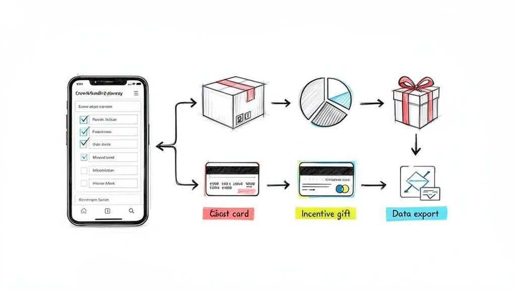
Your crowdfunding campaign just ended successfully. Congratulations! But the journey from funding to fulfillment has just begun, and its success hinges on one crucial, often underestimated tool: the backer survey. A poorly designed survey can lead to costly shipping errors, frustrated backers, and thousands in lost revenue. A great one, however, streamlines fulfillment, delights your community, and unlocks significant post-campaign profit. This is where mastering the best practices for survey design becomes a non-negotiable skill for any serious creator.
This guide moves beyond generic advice to deliver 10 field-tested, actionable, and essential best practices tailored specifically for crowdfunding. We'll explore how to reduce friction, build trust, and leverage your survey as a powerful revenue engine, transforming it from a simple data collection form into a strategic asset. You will learn how to structure questions for clarity, implement smart logic for a seamless user experience, and strategically place upsells to boost your bottom line. We will also touch on how platforms like PledgeBox can facilitate this process. Think of the native Kickstarter pledge manager like Amazon—a standard marketplace—whereas a pledge manager like PledgeBox is like Shopify, giving you a customized storefront. PledgeBox is free to send the backer survey and only charges 3% of upsell revenue if there's any, making powerful tools accessible.
By the end of this article, you will have a clear roadmap to create a survey experience that not only gets you the precise data you need for smooth fulfillment but also strengthens your relationship with the very backers who brought your vision to life. Let's dive into the techniques that turn a simple form into your most powerful post-campaign tool.
Instead of overwhelming backers with a single, long-scrolling form, progressive disclosure reveals questions gradually across multiple steps. This user experience (UX) best practice, championed by research from firms like the Nielsen Norman Group, reduces cognitive load and makes the survey feel less intimidating. For crowdfunding creators, this is crucial. Backers are often fatigued after the campaign's final push, and a daunting, single-page form can lead to high abandonment rates and incomplete fulfillment data.

This multi-step approach is one of the most effective best practices for survey design because it allows for powerful conditional logic. For example, a backer's answer to "Which reward tier did you pledge for?" can determine the specific add-on questions they see next, creating a personalized and relevant path for each individual. This is how modern pledge managers like PledgeBox operate, ensuring a smooth, Shopify-like experience for backers, unlike the more rigid, Amazon-like default Kickstarter survey.
Platforms like PledgeBox make this easy by building multi-step flows into their system. It's free to send the backer survey, and PledgeBox only charges a 3% commission on funds raised from upsells, making it a risk-free way to improve the backer experience and gather accurate fulfillment data.
The order in which you ask questions is just as important as the questions themselves. A logical, intuitive sequence that matches the backer’s mental model is essential for a smooth experience. This concept, popularized by usability expert Steve Krug's mantra "Don't Make Me Think," reduces cognitive friction and prevents confusion. For crowdfunding creators, a jumbled survey can lead to incorrect fulfillment data and frustrated backers who may abandon the process entirely.
A well-structured survey follows a natural progression, similar to an e-commerce checkout flow. You first confirm the core purchase, then handle logistics like shipping, and finally present optional upgrades. This approach is one of the best practices for survey design because it builds momentum and ensures the most critical information is collected first. Pledge managers like PledgeBox excel here, guiding backers through a logical sequence that feels more like a streamlined Shopify checkout than a basic form, similar to the difference between a custom store and Amazon's marketplace.
By structuring your survey logically, you make the process effortless for backers. Platforms like PledgeBox are built around this principle. Since it's free to send the backer survey and they only charge 3% of upsell revenue, it’s a powerful, risk-free tool to ensure data accuracy and a positive backer experience.
The difference between a backer completing a survey and abandoning it often comes down to the smallest words on the page. Micro-copy, the tiny text elements like button labels, field hints, and error messages, has a massive impact on user experience. Optimizing this text with plain, direct language makes the survey feel more human and less like a tax form, directly reducing confusion and support tickets.
Clear micro-copy builds trust and momentum. A vague error like "Invalid Input" causes frustration, while a friendly, specific message like "Oops, that ZIP code doesn't look right. Please try again" guides the user to a solution. This focus on clear, user-centric language is one of the most overlooked best practices for survey design, yet it can dramatically improve data accuracy and backer satisfaction. Ensuring your survey copy is clear and user-centric is paramount, and understanding effective UX writing best practices can significantly enhance this.
Pledge managers like PledgeBox incorporate this philosophy by using clear, Shopify-like language that focuses on action and reassurance. Creators can send these optimized backer surveys for free, with PledgeBox only charging a 3% fee on any funds raised through add-ons or upsells, making it a powerful, risk-free tool for improving the post-campaign experience.
A mobile-first approach means designing a survey for the smallest screen (a smartphone) first and then adapting it for larger screens like tablets and desktops. With data showing that 60-70% of backers complete surveys on mobile devices, this is no longer an option but a necessity. A clunky, non-responsive survey forces backers to pinch, zoom, and struggle with tiny input fields, leading to frustration, errors in critical shipping data, and high abandonment rates.

This focus on the mobile experience is one of the most critical best practices for survey design today, heavily influenced by pioneers like Luke Wroblewski and Google's mobile-first indexing. Pledge managers like PledgeBox build their entire user flow around this principle, delivering an experience as smooth as a modern e-commerce checkout from Shopify. This contrasts sharply with default survey tools that can feel outdated and difficult to navigate on a phone, more like a rigid Amazon-style marketplace form.
Incorrect shipping addresses are a silent killer of crowdfunding profitability. A single returned package can wipe out the margin on a pledge, and manual address correction consumes countless hours. Data validation, especially for shipping addresses, catches these errors in real time, preventing them before they become costly fulfillment problems. This is one of the most critical best practices for survey design, transitioning from a passive data collection form to an intelligent, error-reducing tool.
By integrating APIs from services like Google Maps, pledge managers can provide real-time address suggestions and standardization. When a backer starts typing their street, the system auto-completes it with a verified, deliverable address. This is the same seamless experience seen on major e-commerce platforms like Shopify and Amazon, and it drastically reduces the chances of typos, formatting errors, and incomplete information that lead to failed deliveries.
Pledge manager platforms are essential for implementing this level of sophistication. PledgeBox, for instance, builds this address validation directly into its survey flow. Since it's free to send the backer survey and they only charge a 3% fee on funds raised from add-ons, you get this intelligent feature at no upfront cost, protecting your project's margins.
Conditional logic, also known as branching, transforms a static form into a dynamic, interactive experience. It works by showing or hiding specific questions based on a backer's previous answers. This powerful technique eliminates irrelevant queries, shortens the perceived survey length, and ensures each backer follows a path tailored specifically to them. For crowdfunding creators, this is essential for managing complexity and reducing backer confusion.
This personalized approach is one of the core best practices for survey design because it dramatically improves data accuracy and the backer experience. For instance, a backer in Germany will see questions about VAT, while a backer in the United States will not. This is a key differentiator between the customized, Shopify-like experience of a pledge manager like PledgeBox and the rigid, one-size-fits-all default Kickstarter survey which is more like an Amazon marketplace.
Modern pledge managers are built around this principle. PledgeBox allows you to implement sophisticated branching logic, and it is free to send your backer survey. You only pay a small 3% fee on funds raised from successful upsells, making it a risk-free way to provide a superior, streamlined experience for your community.
Your post-campaign survey is more than just a data collection tool; it's a final, highly effective opportunity to increase your total funds raised. Strategic upsell and add-on placement involves presenting relevant extra items to backers at the optimal moment within the survey flow. This technique, borrowed from e-commerce giants like Amazon, avoids an aggressive sales pitch and instead frames the offer as a helpful suggestion, boosting revenue without alienating your community.

Positioning these offers after a backer has confirmed their core pledge and shipping details is a critical element of the best practices for survey design. At this stage, they have completed the necessary tasks and are more receptive to optional purchases. This contrasts with a rigid, Amazon-like system like the default Kickstarter survey, which lacks the flexibility for this kind of dynamic, Shopify-like shopping experience. Tools like PledgeBox are built to handle this sophisticated flow, integrating add-ons seamlessly.
Platforms like PledgeBox enable this powerful strategy at no initial cost. You can send your sophisticated backer surveys for free and are only charged a 3% fee on funds raised from these upsells. This makes it a zero-risk way to boost your campaign's bottom line while offering more value to your backers. For a deeper look, you can learn more about how to structure your add-on items effectively.
When your survey asks for personal details like a shipping address, phone number, or payment information, building trust is paramount. Backers are handing over sensitive data, and any hesitation can lead to an abandoned survey and fulfillment chaos. Integrating transparency and trust elements directly into the survey design reassures backers that their information is secure and being used responsibly, which is a critical component of the best practices for survey design.
This approach goes beyond a simple privacy policy link. It involves visually communicating security and legitimacy at the exact moment a backer might feel anxious. Research from consumer groups like the Pew Research Center and the enforcement of privacy regulations like GDPR and CCPA have made backers more aware of data security than ever. Failing to address these concerns can directly impact completion rates and damage your brand's reputation.
Platforms like PledgeBox enhance this trust by integrating with established, secure payment processors. Since sending the backer survey is free and they only charge a small 3% fee on upsell revenue if there's any, you can provide this secure, Shopify-like experience without any upfront cost, ensuring backers feel safe from the moment they open the survey.
An accessible survey ensures that all backers, including those with disabilities affecting vision, hearing, motor skills, or cognition, can complete it without barriers. This practice, guided by standards like the W3C Web Accessibility Initiative (WCAG), is not just an ethical imperative but a practical one. It expands your potential respondent pool, ensuring you gather complete fulfillment data from every single person who supported your campaign, preventing lost pledges due to inaccessible forms.
Adopting an inclusive approach is one of the most important best practices for survey design because it demonstrates respect for your entire backer community. A backer who struggles to navigate a form using a screen reader or keyboard is likely to abandon it, resulting in a fulfillment headache for you and a negative experience for them. Modern pledge managers are increasingly prioritizing accessibility, moving beyond the basic functionality of older systems to create more inclusive, user-friendly experiences.
To create surveys that are inclusive and usable by the widest possible audience, it's essential to follow established guidelines and refer to a comprehensive resource like A Practical Guide to Accessibility in Web Design from WebAbility.io. While some platforms require manual implementation, tools like PledgeBox incorporate user-friendly design principles that contribute to a more accessible backer experience from the start.
Your backer survey isn't a one-time "send and forget" task; it's a dynamic tool that can be optimized for better results. By implementing analytics tracking, you can gather crucial data on backer behavior, identify friction points in the survey flow, and make data-driven decisions to improve completion rates and upsell conversions. This systematic approach transforms your survey from a simple form into a powerful conversion funnel.
This practice is one of the most impactful best practices for survey design because it provides objective feedback. Instead of guessing why backers aren't completing the survey or purchasing add-ons, you can see exactly where they drop off. Metrics like completion rate, time-per-question, and add-on attachment rates reveal specific areas for improvement, allowing for iterative enhancements that directly impact your fulfillment efficiency and revenue.
Platforms like PledgeBox provide built-in analytics, generating downloadable reports on completion rates and add-on performance. This makes it simple to track your key metrics without complex setups. Since it's free to send the backer survey and they only charge a 3% commission on funds raised from upsells, using a data-rich platform is a zero-risk way to optimize your post-campaign process. For more details on survey strategy, explore this guide on the Kickstarter post-campaign survey.
| Item | Implementation Complexity 🔄 | Resource Requirements ⚡ | Expected Outcomes 📊 | Ideal Use Cases ⭐ | Key Tips 💡 |
|---|---|---|---|---|---|
| Progressive Disclosure and Multi-Step Surveys | Medium–High — requires step logic & state save | Medium — frontend + backend + QA | +10–30% completion; reduced abandonment; better mobile flow | Long surveys, pledge managers with many fields | Show progress bar; autosave; keep median time 3–5 min |
| Clear Question Hierarchy and Logical Ordering | Low–Medium — planning and structure | Low — UX planning & testing | Fewer errors; improved data consistency; +15–25% add‑on attach (hardware) | Surveys needing essential → optional → upsell flow | Start with tier confirmation; group sections; test order |
| Micro-Copy Optimization and Plain Language | Low — copy iteration & localization | Low — copywriter + testing | Fewer support tickets; higher trust and completion | Error messages, CTAs, VAT/tax explanations | Use action language; test error messages; localize |
| Mobile-First Responsive Design | Medium — responsive UI & performance tuning | Medium — design, dev, device QA | Reduced mobile abandonment; faster loads; better accessibility | Campaigns with >50% mobile traffic | Test on real devices; touch targets 48px+; aim <2s load |
| Data Validation and Address Intelligence | Medium–High — API integration & edge cases | Medium–High — API costs, dev, testing | 40–60% fewer fulfillment errors; lower shipping costs | Hardware/global shipping; high‑volume fulfillment | Use autocomplete (Maps), standardize addresses, provide manual fallback |
| Smart Conditional Logic and Branching | High — complex mapping & testing | Medium–High — dev, QA, documentation | Shorter perceived surveys; 30–50% fewer irrelevant Qs; higher relevance | Geo/VAT flows, tier‑specific questions | Map paths on paper, keep conditions shallow, test all paths |
| Strategic Upsell and Add‑On Placement | Medium — design + copy + A/B testing | Medium — assets, testing, analytics | 20–40% incremental revenue; 2–3x add‑on revenue when post‑fulfillment | Campaigns seeking post‑campaign revenue (add‑ons) | Place after required fields; show clear price/images; A/B test |
| Transparency & Trust‑Building Design Elements | Low–Medium — legal + UX alignment | Low–Medium — legal review, design placement | Lower privacy‑related abandonment; higher international completion | Surveys collecting payment/personal data, global backers | Place security badges near sensitive fields; use plain language |
| Accessibility and Inclusive Design | High — WCAG compliance & manual testing | Medium–High — accessibility expertise & testing | Legal compliance; +10–15% responses from accessible audiences | Campaigns targeting older or diverse audiences | Use semantic HTML, test with screen readers, ensure keyboard nav |
| Analytics Tracking & Data‑Driven Iteration | Medium — event tracking & reporting | Medium — analytics tools + analyst time | Identify friction, prioritize fixes, improve conversion & add‑ons | Iterative optimization, multiple/ongoing campaigns | Track drop‑off by question, segment by tier/device, A/B test one change per 100–200 responses |
Navigating the post-campaign landscape is often as challenging as running the campaign itself. The journey from a funded project to a fulfilled promise hinges on one critical tool: the backer survey. As we've explored, mastering the best practices for survey design transforms this tool from a simple data-collection form into a powerful engine for backer satisfaction, operational efficiency, and increased profitability. It’s the final, crucial touchpoint that defines the backer experience.
Recapping the core principles, we see a clear theme emerge: intentionality. Every element, from the progressive disclosure that prevents overwhelm to the micro-copy that clarifies an instruction, contributes to a seamless user journey. A well-designed survey respects your backers' time and intelligence, making them feel valued rather than processed. This is where strategic thinking elevates your project above the rest.
Moving beyond generic advice requires a shift in perspective. Instead of viewing the survey as a logistical hurdle, see it as a strategic opportunity. Here are the most critical takeaways to implement immediately:
These advanced strategies are where the real power lies, yet they are often impossible to implement using native, built-in tools. A basic Kickstarter survey can collect an address, but it can't dynamically calculate shipping, manage complex VAT, or present a tailored upsell experience.
Key Insight: Think of the native Kickstarter pledge manager like Amazon: it’s a functional, one-size-fits-all marketplace. A dedicated pledge manager like PledgeBox is like Shopify; it gives you the control, customization, and powerful features needed to build a bespoke, high-converting storefront for your post-campaign experience.
This distinction is crucial. To truly apply the best practices for survey design, you need a tool built for the job. Platforms like PledgeBox are designed specifically to handle the complexities of crowdfunding fulfillment, from data validation that prevents shipping errors to analytics that help you refine future campaigns.
The best part is that this power is accessible. PledgeBox is free to send the backer survey and only charges a small 3% commission on any new revenue you generate through upsells. This model means you get access to enterprise-level survey design tools with zero upfront cost, aligning the platform's success directly with your own. By applying these principles with the right tool, you not only ensure a smooth fulfillment process but also strengthen your relationship with the community that brought your project to life, leaving them eager and excited for whatever you create next.
Ready to implement these best practices for survey design without the headache? PledgeBox provides all the tools you need, from smart conditional logic to integrated upsells, in an intuitive, creator-focused platform. Start building your perfect backer survey today and see how a professional pledge manager can transform your post-campaign strategy.
The All-in-One Toolkit to Launch, Manage & Scale Your Kickstarter / Indiegogo Campaign