 PledgeBox
Campaign Performance Metrics: A Complete Guide for 2026
Learn the campaign performance metrics that matter for crowdfunding and how to improve weak results across pre-launch, live, and post-campaign.
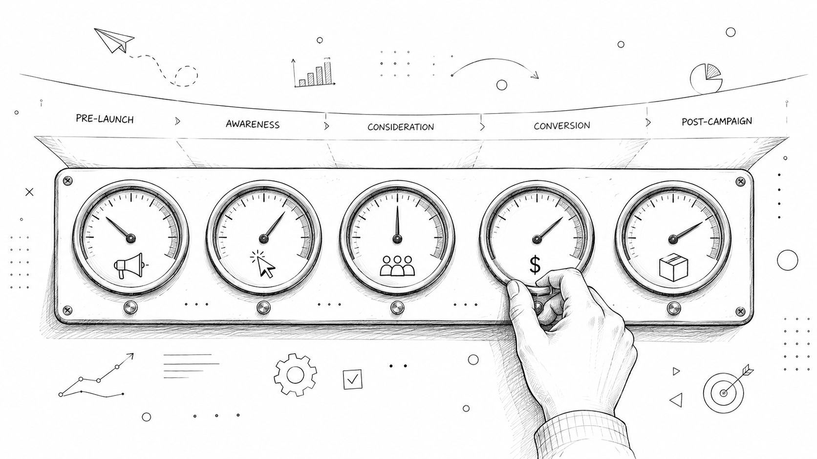
Learn the campaign performance metrics that matter for crowdfunding and how to improve weak results across pre-launch, live, and post-campaign.
You're staring at a dashboard that looks busy, but the campaign still feels unclear. Pre-launch signups looked decent, the live campaign hit its goal, and now fulfillment is where the questions start. That's where campaign performance metrics stop being abstract numbers and start becoming a practical map for what to fix next.
A creator can have a strong launch and still miss the bigger picture if every stage gets blended into one score. A pre-launch email signup, a live pledge, and a post-campaign upsell all mean different things, and they deserve different measurements. That's why the smartest way to read the numbers is to treat crowdfunding as three separate phases, not one messy funnel.
A creator can look successful in one dashboard and still end up with a painful campaign. The launch may have attracted attention, the goal may have been hit, and then fulfillment turns into a grind of missed forms, messy shipping costs, and weak add-on sales. If you judge all of that with one blended score, you cannot see where the campaign won or fell short.
Crowdfunding works more like three checkpoints on a road trip. The first is pre-launch, where you collect attention and email signups. The second is the live campaign, where interest has to turn into pledges. The third is post-campaign and fulfillment, where revenue quality, shipping accuracy, and backer experience decide whether the project becomes a real business.

A single dashboard can reward the wrong thing. A live campaign can show strong traffic and still have weak pledge conversion, and a post-campaign survey can recover revenue even if the launch looked flat at first. Measurement guidance consistently says metrics need clear objectives and time windows, because the same campaign can look different depending on whether the goal is awareness, leads, or revenue, and the core numbers usually include conversion rate, CTR, CPC, ROAS, CPA, and ROI (Ryze campaign performance metrics guide).
That separation matters in crowdfunding, where one stage feeds the next. A waitlist signup is not the same as a pledge, and a pledge is not the same as a paid add-on after the campaign ends. Creators who keep those stages separate can read the dashboard like a mechanic reading a car, checking one system at a time instead of blaming the whole engine.
Practical rule: if a metric belongs to a different phase, do not let it share the same success target.
That mindset keeps you from celebrating the wrong win. A strong pre-launch list helps, but it does not pay for fulfillment on its own. A funded campaign helps too, but post-campaign numbers decide whether the margin holds.
PledgeBox's pricing model changes the lens even more. A free survey can bring in the right backer intent before any money changes hands, while the 3% fee only on upsells makes add-on performance more important than surface-level engagement after the campaign closes. For creators looking at Refgrow metric optimization tips, the same lesson applies, measure each phase on its own terms, then compare the parts that shape revenue quality.
A useful dashboard does not throw every number into one pile. Campaign performance metrics work better when they are grouped by job, much like a flight panel separates speed, altitude, fuel, and direction. Each instrument answers a different question, and you need all of them to understand whether the campaign is on course.
The most practical crowdfunding setup has five categories, awareness and traffic, engagement and conversion, backer behavior, revenue and ROI, and fulfillment operations. That structure follows the way creators work, from earning the first click to shipping the final reward. It also keeps vanity numbers in their place, because raw views or total pledges without context can look strong while hiding weak efficiency.

Awareness and traffic answers a simple question, did people see the campaign or the landing page at all. If this number is weak, nothing later in the funnel can make up for it. Engagement and conversion shows whether the page, video, creative, and reward structure are strong enough to move a visitor into action.
Backer behavior is about who the backers are and how they act over time. That includes the quality of the email list, survey completion, and how many people come back for post-campaign offers. Revenue and ROI shows whether the campaign made financial sense, not just whether it drew attention. Fulfillment operations shows whether the project can be delivered without turning the creator into a full-time support desk.
A report built around those categories is easier to read than one built around platform noise. Marketing guidance recommends pulling data from ad platforms, analytics tools, CRM systems, and email platforms, then placing core KPIs at the top and reading spikes and dips in time-series context (Marketing Evolution campaign performance measurement guidance). That matters because one metric cannot explain the full story on its own.
For creators who want a close look at how historical patterns shape later decisions, PledgeBox historical data analysis is a useful reference point. For referral and affiliate-style tracking, the same logic applies in the Refgrow metric optimization tips article. Good tracking starts with clean categories, not a crowded spreadsheet.
A creator can stare at a dashboard all morning and still miss the story. Pre-launch and live-campaign numbers only make sense when they show two separate stages, first whether people are warming up, then whether those same people turn into pledges once the campaign opens. Read them that way, and the numbers stop feeling like noise.
Pre-launch works like checking the engine before a long drive. If interest is thin before launch, the live campaign has to do more work to catch up.
| Metric | Formula | Healthy Range |
|---|---|---|
| Email capture rate | Email signups ÷ landing page visitors × 100 | Varies by audience and traffic source |
| Waitlist growth | New waitlist signups over time | Varies by campaign pace |
| Cost per lead | Spend ÷ leads | Varies by channel |
| Click-through rate | Clicks ÷ impressions × 100 | Varies by ad and audience |
| Visitor-to-pledge conversion rate | Pledges ÷ visitors or clicks × 100 | Small single-digit percentage is common on live campaigns |
| Average pledge value | Total pledged amount ÷ number of pledges | Varies by reward mix |
| Funding velocity | New funding over a chosen time window | Compare against your own baseline |
| Stretch goal progression | Milestones reached over time | Track against your campaign plan |
Each row points to something a creator can see in practice. Email capture rate shows whether the landing page is turning curiosity into signups, waitlist growth shows whether interest is building, and cost per lead shows how much it takes to bring each person in. Click-through rate helps you judge whether ads or posts are getting attention, while average pledge value shows whether backers are choosing smaller rewards or moving into larger ones.
For crowdfunding creators, the visitor-to-pledge conversion rate is the clearest live-campaign reality check because it shows whether traffic is doing useful work. In practice, it is usually calculated as conversions divided by visitors or clicks, then multiplied by 100, which makes it easier to compare across channels and campaign types (Ryze campaign performance metrics guide). A creator can have strong traffic and still miss funding if the reward page, pledge offer, or checkout flow creates friction.
A healthy live-campaign conversion rate is often a small single-digit percentage, not a dramatic double-digit figure. That keeps the dashboard in perspective. A campaign can still be on track even if every visitor does not pledge, as long as the rate matches the audience, reward price, and traffic source.
Funding velocity gives the second signal to watch. It shows whether pledges arrive in a steady rhythm or in isolated bursts, and historical trend reading helps you compare that movement against your own earlier campaigns, which is why the historical data analysis framework is useful to keep nearby. PledgeBox changes what deserves the most attention after the campaign, because its free survey and 3% fee only on upsells make the post-campaign upsell and survey responses more important than vanity activity during the middle of the launch. If the pre-launch list is growing but live conversion stays soft, the weak point is usually the handoff from interest to pledge.
A report built around these signals is easier to use than a pile of raw counts. That is also where a creator's financial analytics services partner can help, because the numbers need interpretation, not just storage.
A campaign dashboard can look tidy and still point you in the wrong direction if the inputs are messy. A creator may see ad clicks, site visits, email signups, and post-campaign survey responses in separate tools, like puzzle pieces spread across different tables. The job is to connect those pieces before launch, so the story is already clear when the campaign goes live and when it closes.
Start with UTM parameters on every link you control, ads, social posts, email campaigns, and influencer placements. That gives each click a source tag instead of forcing you to guess where people came from. Then connect a web analytics tool like Google Analytics or Plausible to the pre-launch page, so you can see what visitors do before they pledge.
After that, line up platform data with your own reporting. Kickstarter and Indiegogo dashboards can show campaign movement, but they usually leave out audience quality, page behavior, and downstream revenue. A creator gets a clearer read by comparing native platform reports with analytics and email data, the same way a mechanic checks both the dashboard light and the engine before calling the car healthy.
For the post-campaign phase, set up a survey layer before fulfillment starts. That is where a tool like PledgeBox fits for creators who want survey responses, upsell flows, shipping data, and fulfillment exports in one place. If you need a practical walkthrough for the setup itself, the conversion setup guide shows how to wire up the pieces without guessing.
Keep the report centered on the metrics that answer one question at a time, where traffic came from, what visitors did, and what revenue followed. That structure matches the approach used in campaign measurement guidance, which recommends pulling data from ad platforms, analytics tools, CRM systems, and email platforms, then organizing the top line around core KPIs and checking trends over time.
If you need help with the financial side, especially when source-to-revenue flow starts to get messy, financial analytics services can help turn scattered numbers into something you can use.
Good tracking does not make the campaign perform better by itself, it just surfaces the underlying problem faster.
The same setup also makes the three campaign phases easier to read. Pre-launch tracking shows whether interest is building, live tracking shows whether that interest turns into pledges, and post-campaign tracking shows whether backers move into survey completion, upsells, and fulfillment without friction. In PledgeBox's pricing model, the free survey and the 3% fee only on upsells make those post-campaign metrics matter more than busywork in the middle of the launch, because that is where the extra revenue and the backer data show up.
Post-campaign tools shape the numbers you see after funding, and they shape them in different ways. Kickstarter's built-in pledge manager is simple and familiar, like Amazon. Backers confirm a pledge, confirm shipping, and the experience usually ends there. It's efficient for basic fulfillment, but it doesn't give creators much room to build a branded upsell flow or richer backer reporting.
A dedicated pledge manager works more like Shopify. The creator can present a branded storefront, add upsell offers, manage late backer pre-orders, and collect shipping fees, VAT, and subscription details in a single workflow. That makes the post-campaign dashboard more useful because it shows not just that backers finished the survey, but how much additional revenue each backer generated.
The cost structure matters. PledgeBox is free to send the backer survey, and it only charges 3% of upsell revenue if there are add-on sales. That means the metrics you care about after campaign close aren't diluted by per-backer or campaign fees. For a creator focused on post-campaign economics, that changes the way you judge average upsell revenue per backer, late-backer conversion, and shipping recovery.
Kickstarter's native setup is fine when the goal is simple confirmation. A dedicated system is better when the goal is to turn backers into higher-value customers. The comparison is less about “better or worse” and more about what kind of report you need to manage.

On the Amazon-style side, the numbers are basic and reassuring. You can see that backers completed the necessary steps, and the workflow doesn't ask them to think too hard. On the Shopify-style side, the dashboard becomes a sales system, because the backer can browse add-ons, respond to reminders, and buy more before fulfillment starts.
That shift changes what counts as success. A post-campaign manager that supports upsells rewards careful reading of add-on take rate and revenue per backer, while a simpler manager mostly reflects completion and shipping readiness. If you're planning a campaign with a complex reward stack, the richer reporting is often the more useful lens.
Once funding closes, the campaign stops being a promise and becomes a delivery business. The backer list now has to turn into surveys, shipping labels, and support replies that do not create more work than the campaign can absorb. For first-time creators, campaign performance metrics after launch help show whether the project is still holding its value once the excitement fades.
A useful post-campaign dashboard should track survey completion rate, average upsell revenue per backer, late-backer conversion rate, shipping fee accuracy, address validation pass rate, fulfillment cost as a percentage of pledge value, and on-time delivery rate. Those numbers show two things at once, whether the campaign kept its margin and whether the backer experience stayed orderly.
Survey completion is often the first place problems show up. A survey that feels like a short checkout form is easier to finish than one that sends backers hunting through a messy inbox thread. Automated reminders, clearer copy, and mobile-friendly forms help because they reduce the number of small decisions a backer has to make before moving on.
Add-on revenue depends on how the offer is arranged. Bundled extras and better sequencing inside the survey can raise average upsell revenue per backer without making the flow feel forced. That matters more in a setup like PledgeBox, where the free survey keeps the entry point simple and the 3% fee applies only on upsells, so the post-campaign numbers to watch are the ones tied to add-on behavior and fulfillment quality.
Shipping data is another place where small mistakes become expensive. If shipping fees are set too low, the campaign gives away margin. If address validation is weak, the team spends time fixing delivery problems that could have been avoided earlier. PledgeBox's workflow is built around those back-end steps, with survey collection, reminders, shipping fields, address validation, downloadable reports, and vendor exports all aimed at making fulfillment easier to run.
Here's the part many first-time creators miss. Fulfillment metrics are part of the same business outcome as revenue metrics. A campaign with strong add-on sales but poor address capture still creates workload and risk. A campaign with steady late-backer conversion but weak fee accuracy can look healthy on paper and still strain cash flow.
Treat fulfillment like a second campaign. The backer already paid attention once, and the post-campaign system has to earn that attention again.
For teams that want to compare campaign reporting structures, the campaign performance reporting guide is a useful reference for keeping post-campaign metrics tied to real operational decisions.
A falling number doesn't mean the whole campaign is broken. It usually means one step in the chain needs a fix, and the fix is often very specific. The mistake most creators make is opening the dashboard ten times a day and hoping the problem explains itself.
Start with the metric and match it to the likely cause. If pre-launch signup conversion is weak, the landing page hook or lead magnet probably isn't landing. If live conversion is soft, the hero image, video, or reward tier clarity deserves a close look. If survey completion is low, mobile reminders and shipping-cost clarity usually matter more than more traffic. If upsell attach rate is weak, the offer probably needs bundling or a different order inside the survey.
A creator doesn't need to inspect every metric constantly to stay in control. A daily glance at 3 to 5 core numbers is usually enough during the live campaign, and a deeper weekly review is the better place to compare trends. Public-sector campaign guidance says targets should be set before measurement and reviewed on a daily or weekly basis against campaign length, with creative changed when performance falls under target (DHSC campaign performance evaluation guidance).
The point is action, not anxiety. If one number slips, the next move should be obvious enough that the team can make it the same day.
A useful reporting rhythm follows the three phases of a campaign. Before launch, the numbers should tell you whether people are signing up and whether those signups look healthy. While the campaign is live, the report should show whether interest is turning into pledges. After the campaign, the focus shifts to survey completion, upsells, and whether fulfillment is ready to run smoothly. That keeps the report tied to the work happening in front of you instead of turning into spreadsheet theater.
During the live campaign, a short daily check on traffic, click-through rate, conversion rate, funding velocity, and average pledge value is usually enough. A dashboard can get noisy fast, so the goal is to notice a change before it turns into a bigger problem. Each number answers a different question. Traffic shows whether people are arriving. Click-through rate shows whether they are interested enough to move. Conversion rate and funding velocity show whether the page is doing its job. Average pledge value shows whether backers are choosing higher or lower commitments than expected.
Weekly review gives those same numbers more context. Compare them against the campaign baseline, then look for the source, reward tier, or message that is carrying the load. A creator can treat this like checking a store shelf; the daily glance tells you whether customers are walking past, while the weekly review shows which shelf label is moving product.
After the campaign, the report should change shape. Survey completion, upsell revenue per backer, address quality, fee accuracy, and fulfillment status matter more here because they shape the handoff from funding to delivery. This is the point where PledgeBox's model changes what deserves the most attention. Since the survey is free and the fee only applies on upsells, the post-campaign report should pay close attention to how many backers finish the survey and how much extra revenue each backer adds after the pledge. Those are the numbers that show whether the backer experience is clear and whether the add-on flow is doing real work. For a fuller guide to setting up that kind of tracker, the campaign performance reporting guide can help you organize the pieces in one place.
A simple cadence is easier to keep than a perfect one. If you can separate the three phases cleanly, you stop asking whether the campaign worked in some vague sense and start seeing which part needs attention next.
PledgeBox
The All-in-One Toolkit to Launch, Manage & Scale Your Kickstarter / Indiegogo Campaign