Craft a Stellar Unboxing Experience: Crowdfunding Playbook
Craft a memorable unboxing experience for crowdfunding backers. Our playbook covers design, cost, sustainability, and fulfillment to delight supporters.
Craft a memorable unboxing experience for crowdfunding backers. Our playbook covers design, cost, sustainability, and fulfillment to delight supporters.
You've finished the campaign. Funding came through, comments slowed down, and now the hard part starts. Backers stop judging your project by the campaign page and start judging it by what lands on their doorstep.
That's why the unboxing experience matters so much in crowdfunding. For many creators, shipping gets treated like a back-office task. Pick a carton, add filler, print labels, move on. In practice, the box is the final proof that you delivered what people believed in months earlier.
A strong unboxing experience doesn't need luxury packaging or expensive extras. It needs intention. The outside has to survive transit. The inside has to feel organized. The first reveal has to confirm quality, not raise new doubts. If you get that right, you protect your margins, reduce confusion, and give backers a clean handoff from campaign promise to real product.
A creator's most fragile moment often comes after funding, not before it. Backers have waited through updates, manufacturing delays, sample revisions, freight schedules, and address checks. By the time the package arrives, they're ready to decide whether the project felt worth the wait.
That judgment happens fast. The mailer is dented or solid. The product is loose or secured. The insert answers the first question or creates three more. In crowdfunding, where trust has already been stretched across months, the unboxing experience is the final checkpoint.

Backers don't separate fulfillment from branding the way creators do. They don't think, “nice product, weak packaging, but those are different departments.” They experience one thing: your project finally arrived.
That's why the box should be treated like part of the reward, not just a shell around it. A 2021 consumer study cited by Packola found that 55% of people who watch unboxing videos said the video convinced them to purchase, and 40% of consumers will share an image of packaging on social media if it is unique or branded (Packola's unboxing trend summary). For creators, that turns packaging into both conversion support and earned media.
Practical rule: If a backer can't tell within seconds that the package belongs to your campaign, you left branding value on the table.
Crowdfunding also has a community layer that normal ecommerce often lacks. Backers post arrival photos, compare pledge tiers, and show friends what they supported. That's especially true for collectible products, hobby gear, fashion items, and anything with a strong visual identity. If you're shipping apparel or merch, studying how other brands style your football jersey can be useful because it shows how presentation supports identity beyond the core product.
Good packaging can calm the exact anxieties creators deal with post-campaign. Did the reward survive transit? Is setup obvious? Does the product look as premium as the renders suggested? A thoughtful box answers those questions before support tickets start.
Here's what a strong unboxing experience usually does for a crowdfunding project:
If your campaign depends on repeat trust, sequel launches, or add-on sales later, that final physical touchpoint matters even more. The creators who handle this well usually understand that fulfillment isn't the end of the campaign. It's where the brand becomes real. For a useful perspective on keeping that relationship strong after funding, see building strong bonds with your backers.
Most packaging mistakes happen before the first sample is ordered. The creator picks a box based on unit cost, adds some filler later, then tries to “brand it up” with a postcard. That usually produces an unboxing experience that feels patched together.
The better approach is to design the journey in layers. Start with what the backer should feel on arrival. Then decide what the package needs to do visually, structurally, and informationally.

A useful anchor here is purchase behavior. According to Inksoft, 72% of consumers agree that package design can directly influence purchasing decisions (Inksoft's unboxing experience overview). Even in crowdfunding, where the purchase already happened, that same principle shapes how people interpret value when the reward finally arrives.
Campaign branding often looks great on a page and weak in a carton. Metallic gradients, tiny copy, or complex patterns don't always translate well to corrugate, labels, tissue, or folded inserts. You need a version of the brand system that works on physical materials.
Ask three blunt questions:
If the campaign sold craftsmanship, don't ship a noisy, cluttered insert pack. If it sold utility, don't bury setup instructions under decorative layers. Consistency matters more than ornament.
A few branding choices usually hold up well in production:
For inspiration outside crowdfunding, subscription products are useful because they rely heavily on recurring presentation. This guide to spirits subscriptions is a good example of how product category, anticipation, and curation shape the physical experience.
Materials decide whether the box feels wasteful, premium, flimsy, or competent. Creators often overspend on visible decoration and underspend on structure. Backers notice structure first.
Use the smallest carton that safely fits the reward. If the product rattles, shifts, or sinks into filler, the package instantly feels cheaper. Structured inserts, folded board, tissue wraps, or snug compartments usually do more for perceived quality than another printed surface.
The best-looking box is the one that opens cleanly and holds everything in place.
A simple comparison helps during planning:
| Packaging choice | Usually works well when | Usually fails when |
|---|---|---|
| Plain mailer with label | Low-cost accessories, soft goods, simple rewards | Fragile products or premium-positioned campaigns |
| Custom printed carton | Distinct visual identity matters | Budget is already tight and damage risk is high |
| Structured insert | Product shape needs control and presentation | SKU mix changes often |
| Loose filler | Irregular items need cushioning | You want a precise, tidy first reveal |
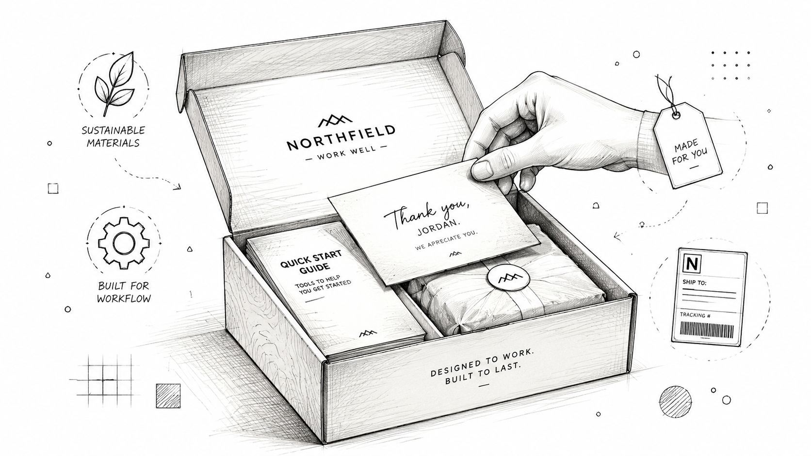
Inserts are where many creators either waste money or solve problems. A thank-you card is nice. A thank-you card that also tells backers what to do next is better.
Use inserts to answer the first questions people will have after opening:
A practical insert stack often includes:
If you only have budget for one insert, make it the one that prevents confusion. In crowdfunding, clarity is usually more valuable than decoration.
The first packaging concept almost never survives production unchanged. It looks good in a render, then the insert is hard to assemble, the carton size pushes shipping costs up, or the whole thing takes too long on the packing line.
That's why creators should treat packaging like a prototype, not a fixed design asset.

Ryder's packaging guidance makes the core issue clear: balancing the unboxing experience with profit margins matters because features like custom inserts can improve perception but also add cost, so creators need to identify which elements deliver value through better customer outcomes (Ryder on the unboxing experience).
When creators review a packaging sample, they often look at aesthetics first. The fulfillment team looks at a different set of questions. Can staff pack it consistently? Does it require extra handwork? Does the insert slow down throughput? Can multiple pledge tiers use the same base box?
Those are the right questions.
Before approving any final packaging setup, test these conditions:
If the package requires craftsmanship on the line, it probably won't scale cleanly. Crowdfunding fulfillment is where elegant concepts get exposed by repetitive manual work.
Some premium touches earn their place. Others just make the bill larger.
Here's a practical way to judge them:
| Element | Often worth testing | Often not worth it first |
|---|---|---|
| Custom insert | Yes, if it protects and presents | No, if it's purely decorative |
| Branded tape | Sometimes, for visible recognition | No, if the carton still feels generic inside |
| Foil stamping | Only for premium collector positioning | Rarely for utilitarian products |
| Printed inside flap message | Often, low-complexity branding touch | Less useful if setup info is still missing |
| Tissue or wrap layer | Good when it controls reveal and scuffing | Weak if it adds clutter without structure |
The rule is simple. If a packaging element helps with protection, clarity, or recognition, it has a stronger case. If it only exists for flourish, scrutinize it hard.
Expensive details don't create a premium unboxing experience by themselves. Clean fit, safe delivery, and a confident first reveal do.
A lot of creators also benefit from revisiting the broader prototype process before they lock packaging specs. This practical read on overcoming limitations in prototyping is useful because packaging problems often start with assumptions made earlier in product development.
Even without getting lost in shipping formulas, one reality shows up fast in fulfillment quotes: larger packaging can become expensive in a hurry. Oversized boxes also create secondary costs. More filler. More storage space. More handling friction.
That's why right-sizing matters. A tighter pack usually improves all of these at once:
If you want a visual walkthrough of how packaging decisions affect practical ecommerce execution, this overview is worth a look:
The best packaging prototype isn't the fanciest sample on the table. It's the one that still looks good after being packed hundreds or thousands of times by people who didn't design it.
A lot of crowdfunding packaging advice still assumes that more layers create more delight. Tissue, belly band, inner card, printed insert, sticker seal, extra sleeve. That can work visually. It can also make the package feel excessive the moment a backer starts throwing pieces away.
That tension is real. EcoEnclose's guidance points to the challenge directly: creators often struggle to preserve a shareable “wow” moment while minimizing waste and shipping weight (EcoEnclose on sustainable unboxing).
Backers usually don't reward waste just because it looks premium. They notice when a small item arrives in a large box. They notice when filler exists only to justify the box size. They notice when three packaging layers could have been one.
A better eco-friendly unboxing experience comes from design discipline:
This doesn't mean the package has to look bare. It means every component should earn its place.
For many creators, sustainable packaging feels like a compromise. It doesn't have to. A minimal, well-organized box often communicates confidence better than an overbuilt one.
The key is to make the intent visible. If you chose recycled board, simpler printing, paper-based protection, or fewer layers, tell backers why. Don't preach. Just explain the decision in a sentence that fits the brand voice.
A useful way to frame it is this:
We cut waste where it didn't add value, and kept the parts that improved protection and arrival quality.
That line of thinking tends to land well because it respects both the product and the backer. It says you made choices, not shortcuts.
If you want a concrete packaging example from a brand built around waste reduction, this piece on new closed loop soap packaging is worth studying. It shows how packaging can support the brand story rather than sit beside it.
Creators often ask what to cut without making the box feel cheap. Start with the parts that create volume but not value.
A fast audit looks like this:
The result is often a package that feels cleaner, ships more efficiently, and creates less friction during packing and disposal. That's not a concession. It's good operations.
A polished box won't save a messy fulfillment process. If pledge data is inconsistent, addresses are wrong, add-ons are unclear, and packing rules change by reward tier, the unboxing experience breaks before the box is even sealed.
Creators need to connect the physical package to the digital workflow behind it.

The cleanest fulfillment runs happen when reward definitions, add-ons, shipping charges, and address collection are finalized before warehouse work starts. That sounds obvious, but many campaign teams still improvise too much after surveys go out.
Think of the basic Kickstarter pledge manager like Amazon. It handles straightforward transactions in a more standardized environment. A dedicated pledge manager is closer to Shopify. You get more control over branding, order logic, upsells, and the backer-facing experience. PledgeBox fits that second model. It's free to send the backer survey and only charges 3% of upsell if there's any. For campaigns with multiple reward tiers, shipping collection, add-ons, and fulfillment exports, that structure changes how much flexibility you have without adding upfront survey cost.
That flexibility matters because the package itself depends on order clarity. The warehouse needs a dependable answer to simple questions:
If those answers live in messy spreadsheets, packing accuracy suffers.
For a broader look at how creators can tighten this handoff, how to successfully fulfill backer rewards covers the operational side well.
The strongest unboxing workflows don't end at delivery. They use the package to collect immediate feedback while the experience is still fresh.
Independent implementation guidance recommends adding QR codes, NFC chips, or image-recognition markers on packaging to launch AR content or short contextual surveys right after opening, with clear calls to action like “Scan here” and testing across iOS and Android to reduce drop-off (guidance on interactive digital elements in unboxing).
That's especially useful in crowdfunding because backers often give the most actionable feedback at the moment of arrival:
Creators often test the product and test the packaging, but skip testing the complete workflow with real order data. That's a mistake.
Run a small live batch first. Use actual survey responses, actual labels, actual inserts, and actual tracking notifications. Send those orders to a small group of trusted backers, team members, or reviewers. Then inspect the whole chain.
A pre-flight check should confirm:
| Workflow stage | What to verify |
|---|---|
| Survey completion | Reward selections and add-ons resolve cleanly |
| Address collection | Formatting and validation catch issues early |
| Pick and pack rules | Warehouse can distinguish tier differences fast |
| Insert logic | Correct cards, manuals, or promos go with each order |
| Tracking messages | Backers get clear updates without confusion |
A good unboxing experience starts weeks before delivery, when your data is clean enough that the right box can be packed the right way every time.
The unboxing experience didn't become important because creators suddenly cared more about boxes. It became important because customer behavior changed. The modern trend is generally traced to 2005 after YouTube launched, and Packaging Dive's summary notes that the format gained traction by the end of 2006. By 2014, Google reported that 62% of people who watched unboxing videos were doing so while researching a specific product (Packaging Dive's historical overview).
For crowdfunding creators, that history matters because it changed what delivery means. Shipping is no longer just the operational endpoint. It's a visible part of the product story. Backers don't only receive rewards. They evaluate the arrival, compare it with expectations, and sometimes broadcast the result to other buyers.
That's why the strongest playbook is practical, not flashy. Build a box that protects the product. Design the reveal so it feels deliberate. Use inserts to reduce confusion. Prototype with fulfillment in mind. Remove waste that doesn't add value. Connect the package to a workflow that keeps order data clean and follow-up easy.
When creators handle all of that well, the box keeps working after it's opened. It reassures the backer. It lowers the chance of support problems. It creates content worth sharing. It raises the odds that people come back for the next campaign with more trust than they had the first time.
Your product may be the reason someone pledged. Your unboxing experience is what makes the entire campaign feel complete.
If you need a post-campaign system that connects surveys, add-ons, shipping data, and fulfillment prep in one place, PledgeBox is built for that workflow. It lets creators send backer surveys for free and only charges 3% on upsells if there are any, which makes it a practical fit for campaigns that need better control without adding upfront survey cost.
The All-in-One Toolkit to Launch, Manage & Scale Your Kickstarter / Indiegogo Campaign