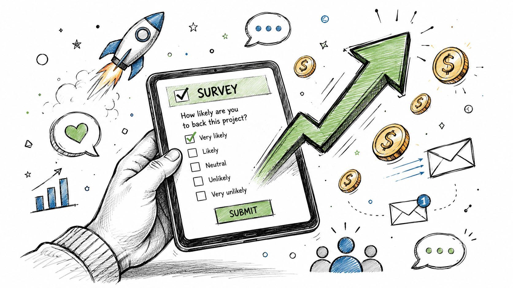
Boost Survey Response Rates: Kickstarter & Indiegogo
Unlock higher survey response rates for your Kickstarter/Indiegogo campaign. Diagnose issues, design better surveys, & boost upsells with PledgeBox.
Unlock higher survey response rates for your Kickstarter/Indiegogo campaign. Diagnose issues, design better surveys, & boost upsells with PledgeBox.
Your campaign funded. Backers are celebrating. Then the hard part starts.
You need addresses, reward selections, shipping charges, add-ons, tax handling, and clean data for fulfillment. If your survey response rate stalls, everything behind it stalls too. Inventory planning gets fuzzy. Customer support piles up. Cash from post-campaign add-ons never materializes. Backers who were excited a week ago start asking why they haven't received anything to confirm their order.
That's why creators should treat survey response rates as an operating metric, not a housekeeping metric. A backer survey is the bridge between a successful campaign and a fulfilled promise.
A crowdfunding survey does more than collect addresses. It confirms what each backer wants, whether they need to pay shipping or tax, whether they want add-ons, and whether their order is ready to move into fulfillment without manual cleanup.
If too many backers ignore the survey, you don't just have incomplete records. You have delayed revenue recognition, uncertain fulfillment counts, and a larger support burden. For creators running hardware, tabletop, fashion, or multi-SKU campaigns, that gap gets expensive fast.

At the practical level, your survey response rate is the share of eligible backers who completed the survey. Methodology guidance recommends defining the denominator clearly and reporting whether undeliverables were excluded and whether follow-ups were used, because response rate alone doesn't guarantee valid data. Teams still need to check for bias and representativeness, not just chase a headline number, as explained in this survey methodology review.
For crowdfunding, that matters because not all missing backers are random. The quiet group may contain international backers waiting on VAT details, late responders confused by reward options, or mobile users who gave up halfway through.
Practical rule: If a survey isn't easy to open and finish on a phone, expect avoidable drop-off.
That rule matters even more now because market guidance shows acceptable response rates vary widely by context, often around 5% to 30%, with 30%+ described as excellent in many market-research settings. Crowdfunding backers are a more engaged audience, so creators should aim much higher. The same guidance notes that many markets now see 80%+ of completions on mobile, which makes mobile usability a technical requirement, not a design preference, according to McKinley Advisors' discussion of response-rate benchmarks.
Post-campaign revenue depends on completion. A backer can't buy an add-on they never see. They can't approve upgraded shipping, confirm a bundle, or fix a reward mismatch if they never enter the survey flow.
That's why survey response rates sit right in the middle of your profit model:
A first-time creator often assumes funding equals completion. It doesn't. Funding gives you a list of backers. A completed survey gives you fulfillable orders.
Don't start by asking whether your number is “good.” Start by asking what's preventing completion.
Survey participation has been falling for a long time across major studies. In the U.S. Current Population Survey, the annual response rate averaged 95% to 96% for the 30 years before 1994, fell below 94% in 1994, and reached 52.5% by 2007, according to this federal review of declining survey response rates. The lesson for creators is simple. Even highly important surveys don't get automatic participation anymore.
For a backer survey, calculate response rate using the same logic good researchers use:
| Measure | Practical crowdfunding definition |
|---|---|
| Eligible backers | People who should receive and complete the survey |
| Completed surveys | Backers who finished the required steps |
| Undeliverables | Emails that never reached the backer, which you should track separately |
| Follow-up status | Whether reminders were sent and to whom |
If your data is messy, your diagnosis will be messy too. A creator who says “we sent surveys to everyone” often hasn't separated bounced emails, refunded backers, duplicate records, and partial completions.
I like a simple three-part lens for crowdfunding surveys.
Backers never saw the message, or it landed at the wrong time. This usually shows up as low open activity and a lot of people who don't even start.
Common causes include:
Backers saw the survey but didn't care enough to act yet.
This happens when the invite doesn't answer the backer's silent question: “Why should I do this today?” If your copy sounds administrative instead of useful, people postpone it.
Backers don't complete surveys because creators need data. They complete them because they want their reward handled correctly.
Backers started but abandoned the process.
This is the classic friction problem. Too many fields, confusing reward logic, ugly mobile layout, unclear shipping steps, or a long upsell path can all kill completion.
A healthy diagnosis usually identifies one dominant failure point, not five equal ones. If opens are low, redesigning questions won't solve much. If starts are strong but completions are weak, your communication isn't the main issue. Find the choke point first.
The highest-converting backer surveys feel short, obvious, and safe to finish. They don't make people think harder than necessary.
Modern evidence supports that approach. A public-health study reported an overall 74.2% response rate, with 69.3% of responses submitted via web, using a web-first, mobile-friendly protocol, as summarized in this discussion of survey response rates and channel design. For creators, the takeaway is practical. Build for web and mobile first, then remove every unnecessary step.

A good backer survey follows the backer's mental sequence, not your internal spreadsheet structure.
Confirm the pledge or reward Start with what they bought. This reassures them they're in the right place and reduces confusion before you ask for anything else.
Handle options and variants Color, size, edition, language, or bundle preference should come early. These are core order details, not afterthoughts.
Offer relevant add-ons Present add-ons after the base reward is clear. Upsells convert better when the backer already understands their main order.
Collect shipping details Address entry feels easier when the backer already sees the order taking shape.
Show the final summary Give them one clean review screen. People complete what they can verify.
Creators often cut the wrong things. They remove useful confirmation steps, then leave in long explanatory text and edge-case questions.
Instead, trim aggressively like this:
If you want a solid reference for building cleaner forms, this guide to best practices for survey design is worth reviewing before you finalize your flow.
Most survey friction shows up on mobile before it shows up anywhere else.
That means:
A backer using a phone while commuting won't troubleshoot your form. They'll close it and mean to come back later.
Here's a walkthrough that shows what a smoother survey flow looks like in practice:
The failures are usually ordinary, not dramatic.
| Problem | What backers feel |
|---|---|
| Too many questions | “I'll do this later.” |
| Confusing reward logic | “I'm not sure this is correct.” |
| Poor mobile formatting | “This is annoying on my phone.” |
| Irrelevant add-ons | “This feels like extra work.” |
| No final confirmation | “I'm not confident this went through.” |
When creators fix these basics, response rates usually improve because the survey stops acting like a test and starts acting like a checkout.
A backer finishes your campaign on a high note. They're excited, maybe even proud to support you. Then life gets in the way.
Day one, they see your survey email while at work and think they'll handle it tonight. They don't. A few days later, another message arrives. If it's vague, they ignore it again. If it's pushy, they start tuning you out. If it's clear, respectful, and easy to act on, you get the completion.
That sequence matters because repeated contact can reduce participation when it feels excessive. In a study of the 2020 Census, the self-response rate in the analysis sample was 77.53%, and households previously sampled for the ACS in December 2019 had a census self-response rate 15.23 percentage points lower, showing a measurable survey-fatigue effect in a major national operation, according to this Journal of Survey Statistics and Methodology article.
Most backers don't need persuasion. They need timing, clarity, and one obvious action.
A useful reminder cadence looks like this:
| Day | Channel | Subject Line Example | Key Message |
|---|---|---|---|
| Day 0 | Complete your survey to confirm your reward | Your order isn't finalized until you submit your details | |
| Day 3 | Reminder to confirm shipping and reward details | Keep it brief, repeat the action, link directly to the survey | |
| Day 7 | Campaign update plus email | Backer survey still open | Reinforce why completion matters for fulfillment timing |
| Day 14 | Final reminder to lock in your order details | Create urgency without sounding threatening |
That cadence works because each touch has a different job. The first announces. The second rescues procrastinators. The third catches people who only read updates. The fourth closes the loop.
The wrong email says, “Please fill out our post-campaign survey.”
The better email says:
Your reward details and shipping information still need confirmation. Complete your survey so we can finalize your order correctly.
That wording does three things. It tells them what's unfinished, why it matters, and what to do next.
Use these principles in every reminder:
If delivery is part of the problem, review practical guidance on how to stop email from going to spam in Gmail. A good cadence can't help if the message never lands where backers will see it.
For reminder wording and follow-up ideas for creators, this post on getting backers to take surveys seriously without overdoing it is a useful companion.
Bad nudging usually has one of these traits:
The cleanest campaigns suppress completed backers immediately and change messaging based on what's left to do.
Once the basics are solid, the next gains come from treating different backers differently.
A creator with one global message for every pledge tier usually gets a decent result. A creator who adapts the message by region, reward type, and order status gets a cleaner response profile and fewer support tickets. That's because relevance does more work than repetition.

Not every segment matters. The useful ones are the segments that change what the backer needs to know or do.
Start with groups like these:
A helpful way to think about this is that segmentation removes irrelevant friction, while personalization adds relevance. If you want a broader marketing perspective on grouped outreach, this guide on improving WhatsApp lead targeting through customer segmentation offers a useful framework you can adapt to backer communication.
Good personalization says, “We know what you backed, and this message applies to you.”
That can mean:
Relevance lowers effort. When backers feel the message fits their order, they don't need to decode whether it applies to them.
There's also a representativeness angle here. A randomized clinical trial of 36,001 patients found that a sequential web-mail-phone protocol produced the highest response rate and representativeness, with response-rate gains often 2 to 3 times larger for Asian American, Black, Hispanic, multiracial, and Native Hawaiian/Pacific Islander patients than for White patients. Extending follow-up beyond day 42 also increased response rates by about 3 percentage points overall, according to this clinical trial on response mode and representativeness.
The crowdfunding lesson isn't that you should start calling backers. It's that the right contact strategy depends on the audience. If one group routinely lags, don't just send more of the same message. Change the sequence, the channel, or the wording.
Most creators don't struggle because they lack intent. They struggle because post-campaign operations become a pile of manual exceptions.
That's where a pledge manager changes the job. Kickstarter's native pledge manager feels a lot like Amazon. Standardized, familiar, and constrained. A dedicated pledge manager works more like Shopify. You get more control over branding, flow, upsells, and the full post-campaign buying experience.
The right setup should handle repetitive operational work so you can focus on exceptions.
That means:
PledgeBox integrates naturally into the workflow. It lets creators send backer surveys with no upfront survey fee and charges 3% only on upsell revenue if any upsell is generated, which aligns the tool with post-campaign sales rather than charging just to collect core backer data. It also supports branded survey flows, address handling, add-ons, fulfillment exports, and backer management in one system. If you want to see the backer-side process, this walkthrough on completing a backer survey in four easy steps with PledgeBox shows the flow.

The big advantage isn't just convenience. It's consistency.
When survey delivery, add-ons, payment collection, address validation, and fulfillment prep all sit in separate tools, creators create friction between steps. Backers feel that friction as confusion. Operations teams feel it as cleanup. A unified flow keeps the backer moving from confirmation to purchase to fulfillment readiness without extra handoffs.
That Shopify-versus-Amazon analogy matters because post-campaign surveys are part storefront, part order management, and part data collection. If you want a standardized path, native tools may be enough. If you want more control over branding, upsells, and operational detail, a dedicated pledge manager gives you more room to run the campaign the way you intended.
Better survey response rates usually come from fewer handoffs, clearer next steps, and less manual recovery work.
For creators, that's the ultimate goal. Not just getting more surveys completed, but getting more usable completions that turn into fulfilled orders and post-campaign revenue.
If you want a simpler way to collect backer details, offer add-ons, and prepare clean fulfillment data, take a look at PledgeBox. It's free to send your backer survey, and it only charges 3% on upsell revenue when upsells happen, which makes it a practical fit for creators who want more control after Kickstarter or Indiegogo.
The All-in-One Toolkit to Launch, Manage & Scale Your Kickstarter / Indiegogo Campaign