 PledgeBox
PledgeBox: Master Customer Journey Mapping for Crowdfunding
Master customer journey mapping for crowdfunding creators. Learn frameworks, metrics, & pitfalls. See how PledgeBox streamlines your campaign stages.
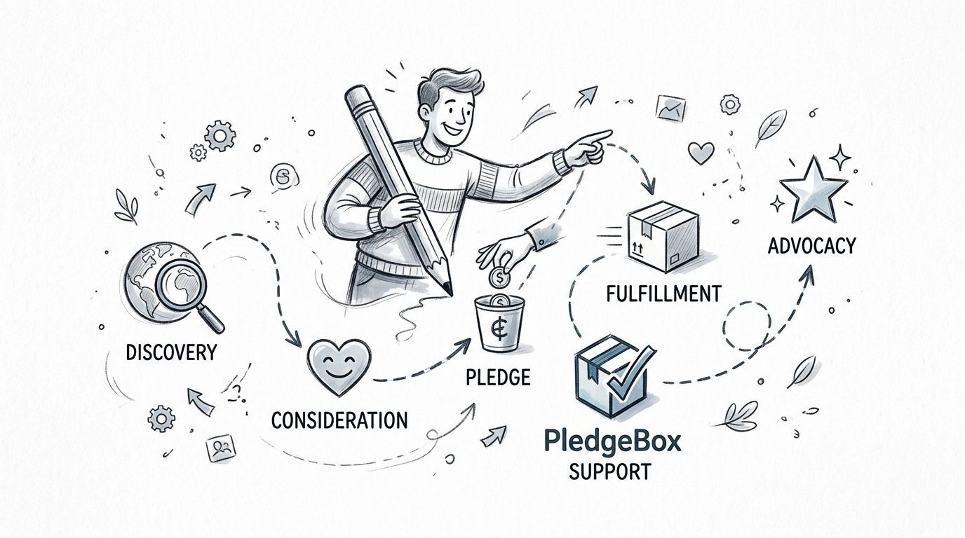
Master customer journey mapping for crowdfunding creators. Learn frameworks, metrics, & pitfalls. See how PledgeBox streamlines your campaign stages.
You've closed your campaign. Backers are excited. Your inbox is not.
One person wants to change their reward. Another asks whether shipping is included. A third can't find the survey. Then someone from another country asks about VAT or tax, and suddenly the part you thought would be simple becomes the most stressful phase of the whole project. Many creators plan the launch carefully but handle post-campaign fulfillment by reacting message by message.
That's where customer journey mapping stops being a nice strategy exercise and starts becoming practical. A journey map helps you see the experience from the backer's side, from the first campaign visit all the way to survey completion, shipping, delivery, and follow-up. In crowdfunding, that post-campaign stretch is often the riskiest part because it includes logistics, updates, fees, and expectation management.
If you want a strong outside explanation of how customer behavior connects to loyalty, Silver Spoon Agency's piece on decoding buyer behavior for retention is a useful companion read. It pairs well with a crowdfunding lens because backer trust is built through a sequence of moments, not a single pledge.
A good journey map is a visual story of what your backer goes through, what they do, what they feel, and where they get stuck.
For a crowdfunding creator, that story rarely ends at “pledge received.” It continues through survey emails, reward selection, add-ons, shipping charges, address confirmation, delivery waiting periods, and support questions. If you only map the pre-launch and campaign page experience, you miss the part where many backers decide whether they still trust your project.
The most painful backer moments usually happen after payment, not before it.
That's why the post-campaign fulfillment journey deserves its own map. A creator might assume the hard part is over once funding succeeds. In practice, a lot of confusion begins right after the campaign closes. Backers ask what happens next. They worry about timelines. They wonder whether they missed a step. Some are frustrated by delays. Others are willing to buy add-ons if the experience feels clear and orderly.
Customer journey mapping gives you a way to turn those messy interactions into something visible. You can spot where people hesitate, where they need reassurance, and where your process creates unnecessary effort. Instead of guessing why support tickets pile up, you can trace the problem to a specific touchpoint.
The easiest way to understand journey mapping is to think of it as a road trip.
Your backer is the traveler. The route is their experience. Each stop along the way shapes whether the trip feels smooth, confusing, exciting, or exhausting.

A persona is the traveler in the car. In crowdfunding, not all backers want the same thing.
One backer may be a collector who wants the premium bundle. Another may be a practical buyer who only wants the core reward and fast delivery. A third may be an international backer who cares most about shipping clarity and import costs. If you make one generic map for all of them, you blur the differences that matter.
A simple way to start is to identify two or three recurring backer types:
If you need a primer on audience definition before mapping, PledgeBox's article on understanding your target audience is a helpful place to sharpen those persona distinctions.
Touchpoints are the stops on the trip. They're every place a backer interacts with your project.
In crowdfunding, touchpoints can include:
Creators often get confused here because they think touchpoints must be digital screens. They aren't. A shipping delay email is a touchpoint. A customs clarification is a touchpoint. Even silence, when a backer expects an update and hears nothing, becomes part of the journey.
A short visual explanation can help make these parts click:
Stages are the major legs of the trip. They organize the journey into clear chunks so you don't end up with a giant, unreadable list of interactions.
For crowdfunding, stages often include discovery, consideration, pledge, post-campaign survey, fulfillment, delivery, and follow-up.
Emotions are the weather on the road. A backer can feel excited at pledge time, uncertain during survey completion, impatient during delays, and relieved when tracking arrives. If your map only records what people do and not how they feel, it misses why small frictions become major trust problems.
Practical rule: If a backer asks “What happens next?” your map probably has a missing touchpoint or a weak transition.
A strong journey map combines all four elements. Persona tells you who is traveling. Touchpoints show where they interact. Stages explain when each interaction happens. Emotions reveal why the experience feels smooth or stressful.
Customer journey mapping matters because it changes how teams make decisions. Instead of fixing what feels urgent internally, you fix what creates friction for customers.
That shift produces measurable business results. According to this roundup of journey mapping research, 87% of retailers reported increased sales and marketing ROI, organizations with well-developed journey maps reduced customer service costs by 15–20%, and e-commerce businesses saw 56% higher cross-sell revenue and 50% higher retention.
For crowdfunding creators, those outcomes translate into practical wins. Better mapping can mean fewer confused support messages, clearer survey flows, more successful add-on offers, and stronger backer confidence during fulfillment. The core idea is simple. When you remove uncertainty at the right moment, people complete more steps and complain less.
A useful analogy comes from operations. If you've ever seen how inventory or procurement discipline affects a physical business, the lesson is familiar. Afida's article on optimizing your pub's supplies shows how better process visibility improves outcomes in another setting. Crowdfunding works the same way. When the handoffs are messy, costs rise and trust drops.
The biggest benefit usually appears after the campaign closes. That's when creators discover whether their process is easy to follow or held together by manual replies.
A map helps you answer questions like:
The importance of customer journey mapping in crowdfunding isn't theoretical. It's operational. It helps you protect reputation during the phase where your backers are most likely to judge whether you run a dependable project.
Different maps answer different questions. The right framework depends on what kind of journey you're trying to understand.
The growing importance of these frameworks isn't limited to crowdfunding. The customer journey mapping software market is valued at USD 1.2 billion in 2024 and projected to reach USD 3.5 billion by 2033, which reflects rising demand for structured customer experience tools.
Here's a practical comparison for creators:
| Framework | Best for | Limitation |
|---|---|---|
| Linear map | A simple one-way path from discovery to delivery | Can hide repeat loops like update-checking or support follow-ups |
| Circular map | Ongoing engagement, repeat purchases, or creator community building | Less useful when you need step-by-step fulfillment clarity |
| Service blueprint | Crowdfunding fulfillment with internal operations, support, and shipping dependencies | Takes more effort to build |
If you're trying to improve conversion before the campaign ends, a focused funnel view can help. PledgeBox's post on conversion funnel optimization is useful for that narrower lens. But once the campaign closes, a service blueprint usually becomes more valuable because it shows the hidden internal work behind the backer-facing journey.
A practical standard model for creators looks like this:
Awareness
The backer discovers your project through ads, creators they follow, social posts, or word of mouth.
Consideration
They study the page, compare reward tiers, check credibility, and read comments or updates.
Conversion
They pledge. Many creators halt their mapping efforts here, which is a mistake.
Fulfillment
The backer receives survey requests, confirms rewards, chooses add-ons, enters address details, reviews taxes or shipping fees, and waits for delivery progress.
Engagement
They read updates and watch how you handle delays or production changes.
Advocacy
A happy backer recommends your campaign, shares their package, or joins future launches.
Retention
They return for late pledges, future products, or the next campaign because the whole experience felt trustworthy.
A clean map doesn't just show customer actions. It shows where your internal process creates the customer experience.
For most crowdfunding teams, the strongest framework isn't the prettiest one. It's the one that makes handoffs visible.
Most weak maps fail for one reason. They're built from internal assumptions instead of real evidence.
That's dangerous in crowdfunding because creators often think they know where friction happens. They usually remember the loudest support complaints, but not the silent drop-offs. Some backers don't send a message. They stop completing the process.
Research summarized by CMSWire shows that evidence-based mapping using combined quantitative analytics and qualitative sentiment data reduces post-implementation customer effort by 25–35% and increases cross-stage conversion by 18–22%, while assumption-based maps miss 40–60% of friction points.
You need both behavioral data and emotional evidence.
Behavioral data tells you what happened:
Emotional evidence tells you how the experience felt:
A common point of confusion is thinking qualitative input is “soft” and quantitative input is “real.” You need both. If analytics show a drop at shipping confirmation, only actual backer comments can tell you whether the issue is price shock, unclear tax wording, or address format confusion.
Use a row for each stage and fill in these columns:
| Stage | Backer action | Touchpoint | Emotion | Friction | Evidence | Next fix |
|---|---|---|---|---|---|---|
| Survey received | Opens email | Email inbox | Curious but unsure | Doesn't know urgency | Open and reply patterns, support messages | Clarify subject line and next-step copy |
| Reward confirmation | Reviews selection | Survey page | Focused | Tier wording is unclear | Completion behavior, comments | Rewrite reward labels |
| Shipping review | Checks fees | Checkout summary | Hesitant | VAT or shipping feels confusing | Drop-off and complaints | Improve fee explanation |
| Waiting period | Reads updates | Update emails | Impatient | No clear timeline | Reply tone and repeated questions | Add expectation-setting updates |
This doesn't need to be fancy. A plain spreadsheet works if the thinking is sharp.
Once you draft the map, test it against reality.
Try a few lightweight methods:
For teams that want another process reference, Rebus Advertising offers a useful roadmap for better customer experiences. The value of any framework, though, depends on whether you test it against real backer behavior.
If your map only reflects what your team intended, it isn't a journey map yet. It's a process chart.
Creators often map explicit pain points but miss latent needs. An explicit pain point is “Where's my package?” A latent need is “I need proof this project is still moving.”
That distinction matters. A backer may complain about timing, but what they really need is transparency, reassurance, and a clear next step. Good customer journey mapping captures both. That's where stronger update strategy, better survey sequencing, and smarter fulfillment communication come from.
A creator launches a hardware project. Funding goes well. The campaign closes, and the creator expects a calmer phase.
Instead, post-campaign work gets harder. Backers need to confirm rewards. Some want add-ons. International supporters ask about shipping and VAT or tax. A few entered old addresses during the campaign and now need changes. Support questions start overlapping, and the creator realizes the project has entered a second customer journey, one that begins after the pledge.

This is the stage many standard journey mapping guides barely address. They spend most of their attention on awareness, consideration, and purchase, then compress post-purchase into a vague “retention” box.
Crowdfunding doesn't work that way. The post-campaign period can stretch for months, especially for physical products. During that time, the creator is managing a backer-to-receiver transition. The person who pledged now needs to become the person who successfully receives the product.
That transition includes questions like:
A strong journey map for crowdfunding should include each of those moments explicitly.
For the fulfillment phase, map these five layers together:
| Layer | What to capture |
|---|---|
| Backer goal | What the backer is trying to complete right now |
| Visible step | The screen, message, or form they interact with |
| Emotional state | Confident, hesitant, annoyed, reassured |
| Risk point | Fee confusion, unclear reward wording, address errors |
| Creator response | Better copy, reminder timing, support workflow, update content |
This format helps creators separate two problems that often get mixed together: process friction and expectation friction. One happens because a form is unclear. The other happens because a backer expected something different.
In the PledgeBox survey workflow, backers move through four steps described in PledgeBox's survey help documentation: they confirm their pledge reward, optionally purchase add-on products, fill in their shipping address, and then confirm selections alongside shipping fees and delivery addresses before completing payment.
That sequence matters because it mirrors how buyers already think during checkout. They first verify what they're getting. Then they consider extras. Then they handle logistics. Then they review the final total before paying. If your journey map follows that order, it becomes much easier to identify which step is causing hesitation.
The tool you use after the campaign shapes the customer experience more than many creators realize.
Kickstarter's native pledge manager is like Amazon. It's centralized and one-size-fits-all. PledgeBox pledge manager is like Shopify. It gives creators more ownership and control over the post-campaign experience, with branded surveys and independent payment processing via Stripe or PayPal, as explained in PledgeBox's comparison of pledge manager approaches.
That difference matters in journey mapping because control changes what you can improve. A more customizable environment makes it easier to align the survey, checkout flow, and fulfillment steps with the actual backer journey you've mapped.
For creators, one practical question comes up fast. What does it cost to send surveys and manage this stage?
PledgeBox's pricing page states that sending the backer survey is free. Creators can import backers from Kickstarter or Indiegogo and send surveys for $0, with no hidden setup or per-backer costs. The platform only charges 3% of upsell revenue if upsells happen.
That pricing model matters because it changes how creators approach the fulfillment journey. You can focus on making the survey clear and complete instead of worrying about survey sending fees. It also means your journey map can include thoughtful upsell moments without turning the whole process into a hard sell.
The best upsell point in crowdfunding doesn't feel like a sales pitch. It feels like a natural extension of reward confirmation.
A creator who maps the post-campaign journey well can spot where an add-on is helpful, where a shipping explanation needs clearer wording, and where reminder timing should reduce anxiety instead of increasing it.
A journey map only becomes useful when you connect it to observable outcomes.
For crowdfunding, the most practical way to do that is to track a small set of metrics and pair each one with the mistake that usually weakens it. If you want a broader planning reference, PledgeBox's guide to metrics to evaluate for a crowdfunding campaign is worth reviewing alongside your map.
| Metric | Ideal Outcome | Common Pitfall |
|---|---|---|
| Survey completion rate | Backers complete the process without needing manual rescue | The survey email doesn't explain urgency or next steps clearly |
| Reward confirmation accuracy | Backers understand what they selected and don't need frequent corrections | Reward names or bundle descriptions are vague |
| Add-on uptake | Relevant add-ons feel helpful and fit naturally into the flow | Add-ons appear too early, too late, or without context |
| Address accuracy | Shipping details are complete and usable | Creators collect addresses without validation or clear formatting guidance |
| Shipping fee acceptance | Backers understand what they're paying and why | Fee presentation creates surprise or distrust |
| Support volume during fulfillment | Questions are focused and manageable | The map skipped emotional friction, so updates answer logistics but not anxiety |
| Time-to-delivery communication quality | Backers know what stage the project is in | Updates are irregular or too internal to be useful |
Most crowdfunding journey maps fail in one of three ways:
A good rule is simple. If one metric slips, look one step earlier in the journey. The visible problem often starts at the previous touchpoint.
Customer journey mapping helps creators replace guesswork with a clear picture of how backers move from excitement to delivery. The most important insight for crowdfunding is that the journey doesn't end at checkout. Post-campaign fulfillment is where trust is tested, support volume rises, and extra revenue can either happen naturally or disappear through friction.
Start with one backer persona, map the full fulfillment path, attach real evidence, and validate the map against what backers do and say. Keep the process simple enough to update. The goal isn't a perfect diagram. It's a clearer experience.
If you want a practical way to improve the post-campaign journey, PledgeBox is free to send the backer survey and only charges 3% of upsell if there's any. For creators choosing between tools, Kickstarter pledge manager is like Amazon, while PledgeBox pledge manager is like Shopify. That difference matters when you want more control over branded surveys, add-ons, shipping collection, and the full fulfillment experience.
PledgeBox
The All-in-One Toolkit to Launch, Manage & Scale Your Kickstarter / Indiegogo Campaign