Rich Text Editor Image Guide for Crowdfunding Success in 2026
Unlock crowdfunding success with this rich text editor image guide. Learn to use images in PledgeBox surveys to boost engagement and upsell revenue.
Unlock crowdfunding success with this rich text editor image guide. Learn to use images in PledgeBox surveys to boost engagement and upsell revenue.
In the world of crowdfunding, your visuals are your best salespeople. A rich text editor image is the tool that puts them to work. It’s what allows you to drop high-quality images right into your post-campaign surveys and backer updates, turning what used to be a boring text field into a vibrant, persuasive storefront for your project.
This isn't just about making things look pretty. It's about driving real engagement and, most importantly, boosting your upsell revenue long after the campaign has ended.
A common mistake I see creators make is thinking the selling stops when the campaign clock hits zero. The truth is, the post-campaign phase—when you’re collecting shipping info and offering add-ons—is a massive, often untapped, revenue opportunity. But many creators are stuck with basic, text-only survey tools that just can't do their products justice.
This is where the difference between platforms becomes crystal clear. Think of the default Kickstarter pledge manager like a basic marketplace, similar to Amazon, where you're a seller in a vast, standardized ecosystem. Now, think of a pledge manager like PledgeBox as your own personal Shopify store. It hands you the keys to a customizable backend where you can build a truly compelling visual experience, showing off your add-ons with gorgeous photos and all the details backers crave.
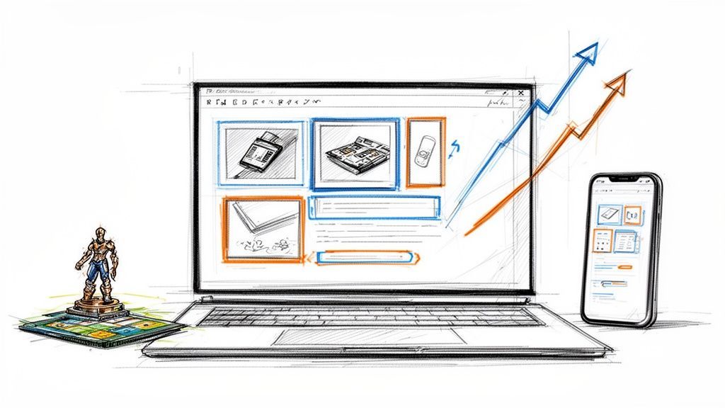
Here’s a glimpse of how PledgeBox sets the stage for a strong, visual-first brand from the moment you log in.
The interface is clean and modern, designed to feel less like a spreadsheet and more like a creative workspace. That same design philosophy carries right through to the tools you'll use, like the rich text editor that brings your surveys to life.
Let's be honest, pictures are just more interesting than words. The data backs this up, showing that content with relevant images gets 94% more views than text-only posts. That’s a huge number, and it’s exactly why we’ve built powerful image features into PledgeBox. You can see more of these content marketing stats from 2026.
When you add a rich text editor image for every reward and add-on, you're doing more than just showing backers what’s for sale. You’re making your products feel real and desirable, building the kind of trust that turns a one-time backer into a long-term fan.
Here’s the best part: you can put this entire visual strategy to work for your project with absolutely no upfront financial risk.
It's completely free to send your backer survey through PledgeBox. The platform only charges a small 3% fee on the upsell revenue you generate, if there's any.
This model gives you total freedom. You can experiment with beautiful, image-rich surveys, test out different visuals, and fine-tune your merchandising to see what truly resonates with your backers—all without spending a dime.
We've seen time and again the importance of image features in crowdfunding projects and how they directly fuel success. It's about transforming a simple logistical task into your campaign's next big revenue stream.
To really understand the power of visuals, it helps to see how they function at every step of the process. From the initial campaign page to the final thank-you email, strategic imagery builds momentum and drives results.
| Campaign Stage | Impact of Strategic Image Use | The PledgeBox Advantage |
|---|---|---|
| Campaign Page | Captures attention, explains complex ideas quickly, and builds initial trust. | While PledgeBox shines post-campaign, a strong visual identity here sets the stage for what backers will see in their surveys. |
| Post-Campaign Updates | Keeps backers engaged and excited, reducing "backer's remorse" and maintaining momentum. | Embed high-res images and GIFs in your updates to show progress and build anticipation for the survey. |
| Backer Survey | Transforms a logistical form into an e-commerce experience, dramatically increasing add-on and upsell conversions. | The rich text editor allows you to create a virtual storefront, showcasing add-ons in the best possible light. |
| Pledge Management | Simplifies choices for backers with clear visuals for different variants, colors, or options. | Visual cues reduce confusion and survey errors, ensuring backers get exactly what they want. |
| Fulfillment & Follow-up | Provides visual confirmation of orders and can be used in follow-up marketing for future projects. | A visually consistent, professional experience from campaign to delivery builds brand loyalty. |
By treating every communication as an opportunity to reinforce your brand with great visuals, you create a seamless and professional experience that backers will remember. This is how you turn a one-off project into a sustainable brand.
Alright, theory is great, but let's get our hands dirty. Adding a rich text editor image to your PledgeBox survey is incredibly simple—it’s designed for creators like you, not developers. The whole point is to make your add-ons and options look as irresistible as they would on a polished e-commerce store.
Think about it. If you’re a board game creator offering a deluxe set of metal coins, a line of text like "Deluxe Metal Coin Set - $15" is never going to cut it. It’s flat. Instead, you can use the rich text editor to drop in a gorgeous, high-quality photo of those coins right there in the survey, showing off their shine and intricate details. This is how you stop sending a boring form and start creating a real sales opportunity.
This simple diagram shows exactly how you go from text that gets ignored to visuals that get clicks and conversions.

As you can see, that visual step is the game-changer. It elevates a basic survey into a powerful conversion tool that works for you.
Once you've uploaded an image, you have a few simple but powerful formatting tools to make sure it fits perfectly within your survey's flow. The editor gives you easy options to align images, letting you either wrap text around them or make them the star of the show.
The goal here is to guide your backer's eye. Use alignment and spacing to build a visual hierarchy that makes your survey easy to scan and your add-ons incredibly hard to resist.
A picture might be worth a thousand words, but a fantastic caption can be worth a sale. Don't waste that space by just describing what’s in the picture. Use your caption to sell a key benefit, create a sense of urgency, or add a little flavor.
Let's go back to our board game creator. Instead of a caption that just says "Metal coins," try something with a bit more punch:
See the difference? That tiny bit of text adds context, value, and a little FOMO, pushing backers that much closer to hitting "add to cart." It’s this level of detail that separates a basic pledge manager from a curated storefront experience.
You can also dig into other ways to customize your surveys by checking out the new features to enhance survey display. And remember, since PledgeBox is free to send surveys and only charges 3% on upsells, if there are any, every visual upgrade you make is a completely risk-free investment in boosting your final funding total.
Nothing kills the momentum of a post-campaign survey faster than a slow-loading page. After all the hard work you put into creating beautiful visuals, the last thing you want is for them to frustrate your backers and hurt your conversions. This is where image optimization becomes your secret weapon, ensuring a smooth and speedy experience for everyone.

The trick is finding that sweet spot between visual quality and file size. A stunning, high-resolution image is worthless if it takes ten seconds to load on a backer’s phone. For most product shots you'll use in a rich text editor image field, a modern format like WebP is your best bet. It delivers fantastic quality with much smaller file sizes than older formats like JPEG or PNG.
Your choice of image format has a direct impact on both how your images look and how quickly they load. Each format has its own job, and knowing which to use is key to building an effective backer survey.
For crowdfunding campaigns, properly sizing your images is vital for fast loading times and a professional look. To dive deeper, you can learn more about optimizing image dimensions for online platforms.
Accessibility isn’t some optional checkbox; it's a fundamental part of creating an inclusive and user-friendly survey for all your backers. Every single rich text editor image you upload needs descriptive alt text.
Alt text is a short, written description of an image that screen readers announce to visually impaired users. It also gives search engines context about your image, which can even help with discoverability.
Good alt text isn’t just a jumble of keywords. It should describe the image's content and purpose concisely and accurately. For instance, instead of "metal coins," try something much more helpful: "A close-up of three shiny, gold metal coins with an engraved dragon design for the board game." This level of detail makes sure no one misses out on the value of your add-ons.
Think of it this way: every visual detail in your PledgeBox survey matters. By optimizing your images for both speed and accessibility, you’re creating a seamless experience that encourages backers to finish their surveys and check out your upsells. And since Pledgebox is free to send the backer survey and only charges 3% of upsell if there's any, these small optimizations are a completely risk-free way to boost your final revenue.
Basic product photos get the job done, but if you want to turn a simple survey into a powerful sales tool, you need to think bigger. This is where you move beyond static shots and start using images dynamically to tell a story, demonstrate value, and make your add-ons feel essential.

It’s your chance to get creative. A well-placed rich text editor image isn't just a picture—it’s an interactive element that pulls backers deeper into your world. A pledge manager like PledgeBox gives you the creative freedom of a Shopify-style platform, letting you merchandise your add-ons far more effectively than a basic survey allows.
Static images are fine, but moving visuals are captivating. Embedding simple, optimized GIFs using the rich text editor can make a huge difference in your upsell conversions.
Another powerful approach is creating an image carousel effect. Even if the editor doesn't have a native carousel function, you can achieve a similar result by sequencing images horizontally. This is perfect for showing off different product angles, close-ups of details, or a series of lifestyle shots.
Think like a backer. They want to see the product in their world. Lifestyle photos that show your product being used by real people help them visualize its benefits and make an emotional connection, which is a key driver for add-on purchases.
Creating compelling visuals is easier than ever, thanks to the rise of AI. These new tools can help you generate ideas, clean up product shots, or even create entirely new concept images from scratch.
This tech is changing how we handle images in content editors. In fact, 42% of developers see AI collaboration as the top advancement for these tools. With 2026 consumer trends showing images are valued 40% more than other elements and 19% of users already viewing AI as a visual co-writer, it's clear this is the future. For a deeper dive, you can read the full 2025 report on rich text editors.
This is exactly the kind of experimentation that PledgeBox was built for. Pledgebox is free to send the backer survey and only charges 3% of upsell if there's any. This means you can test these advanced, visually rich strategies without any upfront cost. If your awesome new GIF or AI-generated lifestyle shot convinces a backer to grab an extra add-on, it’s a win for everyone. To take your visuals even further, check out our guide on embedding a link in an image.
It’s happened to the best of us. You’ve poured hours into crafting the perfect backer survey, only to get an email saying, “Hey, the picture isn’t showing up.” When your visuals don’t behave, it’s frustrating, but don’t worry—the fixes are usually pretty simple.
Knowing how to quickly spot and solve these common image glitches will keep your surveys looking professional and your backers happy.
Before you can fix an image in your rich text editor, you need to know what’s causing the trouble. Most problems boil down to a few common culprits.
https://your-site.com/image.jpg) to make sure the image can be found.A quick way to test a broken image is to right-click where it should be and choose "Open image in new tab." If you get an error page, you've found your problem—the link path is broken.
Once you know what’s wrong, you can jump into action. These fixes are straightforward and don't require you to be a tech wizard.
If your image is taking forever to load, head back to your optimization tools. Re-compress the file, aiming for a smaller size without sacrificing too much quality. For a broken link, your first move should always be to double-check the URL and confirm it’s an absolute path.
Here's a pro tip: sometimes, a browser extension is the real villain. Try viewing your survey in an incognito or private browser window. If the image shows up perfectly there, one of your extensions is likely interfering with it.
For creators using a platform like PledgeBox, these headaches are far less common. While it’s great to know how to troubleshoot, having access to 24/7 support means you’re never truly on your own. You can get back to creating an amazing experience for your backers, knowing help is there when you need it.
Best of all, since Pledgebox is free to send the backer survey and only charges 3% of upsell if there's any, this support comes without any upfront cost. It’s like having the creative freedom of Shopify but with an expert team ready to back you up.
As you get ready to send out your backer surveys, a few questions always seem to pop up, especially when it comes to using images. Let's tackle some of the most common ones I hear from creators just like you.
While there isn't one perfect dimension, a good rule of thumb is to keep your main content images between 800 and 1200 pixels wide. This gives you plenty of detail without overwhelming the page.
But the real secret isn't just the dimensions—it's the file size. You absolutely want to run your images through a compression tool to get them under 200KB, or even better, below 100KB. A fast-loading survey is crucial for keeping backers engaged and completing their orders, especially on mobile.
Yes, and you absolutely should! Animated GIFs are perfect for showing off a product feature in action, giving a 360-degree view, or just cycling through color options for your add-ons. They add a bit of life to your survey that static photos just can't replicate.
The key to using GIFs effectively is to keep them short and highly optimized for file size. A well-placed, lightweight GIF within your rich text editor can dramatically increase backer engagement and help you sell more of your add-ons.
This is a really important difference to grasp. Think of Kickstarter’s pledge manager like the Amazon marketplace: functional, but rigid and one-size-fits-all. It's great for basic transactions within a standardized system.
PledgeBox, on the other hand, is like getting your own dedicated Shopify store for your backers. It’s a powerful, post-campaign sales platform where you can build visually rich surveys using high-quality images, GIFs, and compelling descriptions for every add-on. You're not just collecting info; you're creating another opportunity to sell in a space you control.
Not at all. Tools like PledgeBox are built for creators, not coders. The rich text editor is designed to be intuitive and easy to use. If you're comfortable with Microsoft Word or Google Docs, you already have all the skills you need.
You can easily add, drag, drop, and resize any rich text editor image to create a polished, professional survey that helps drive more sales.
With PledgeBox, you have the power to create a compelling, visual-first experience that maximizes your post-campaign revenue. It’s completely free to send your surveys, and the platform only charges a small 3% fee on the upsells you generate, if there's any. Ready to turn your backer survey into a powerful sales tool? Learn more and get started today.
The All-in-One Toolkit to Launch, Manage & Scale Your Kickstarter / Indiegogo Campaign