 PledgeBox
Mobile Survey Design for Backers: A Practical 2026 Guide
Learn mobile survey design for backer surveys that boost upsells, cut drop-offs, and ship faster. Practical layout, UX, and testing tips inside.
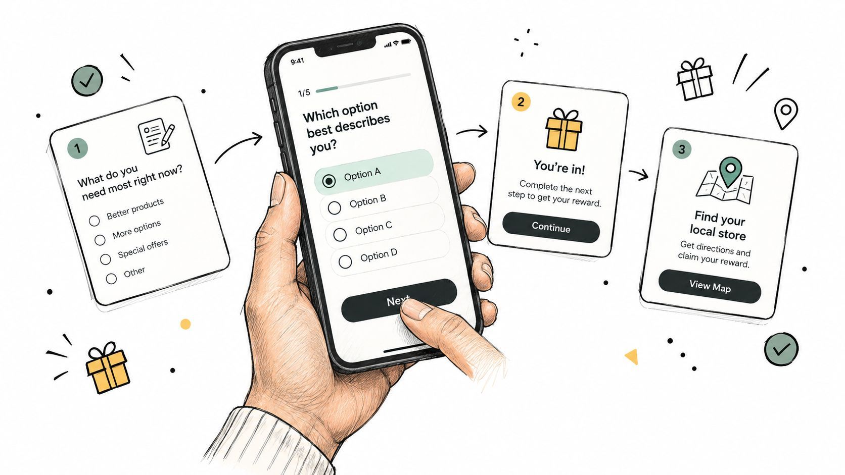
Learn mobile survey design for backer surveys that boost upsells, cut drop-offs, and ship faster. Practical layout, UX, and testing tips inside.
The campaign funded at 11:58 PM. Comments are still arriving, shipping questions are filling Slack, and your team is trying to turn a backer list into accurate orders. Respondents are likely to open the pledge survey on a phone, often between other tasks. That small screen is where you either recover post-campaign revenue or create another fulfillment problem.
A backer survey isn't just a form. It's a conversion and operations flow. The question order affects completion, the reward selector affects add-on sales, and the address experience affects warehouse accuracy and customer support workload. Mobile survey design connects revenue to fulfillment, so every tap should have a clear operational reason.
The campaign has closed, pledges are recorded, and backers are ready to confirm what they will receive. The survey now decides whether those pledges become accurate orders, incomplete records, or additional revenue. Variant choices, shipping details, taxes, and optional extras all compete for attention on a small screen.
Mobile is a primary survey channel. Kantar reported that 56% of online surveys worldwide were completed on mobile devices in 2024. Dynata also reported that mobile accounted for 59% of survey starts in 2023, compared with 54% in 2022. Design for the phone first, then make the desktop version comfortable.
Operational rule: Every screen should answer one question for your team and make one action obvious for the backer.
Define the order record before designing the flow. Identify the reward, size, color, shipping address, tax jurisdiction, and optional upgrade details required for fulfillment or payment. Remove questions that do not support one of those decisions. Pew Research Center recommends one question per screen, large touch targets, vertical layouts, limited typing, and avoiding matrix questions for mobile surveys.
Required decisions should move the order toward a shippable state. Optional commerce belongs after the backer understands the confirmed reward, with relevant add-ons presented as clear choices rather than barriers to completion. This sequencing protects completion while preserving upsell opportunities.
The pledge manager also affects the revenue decision. Kickstarter's pledge manager follows an Amazon-like marketplace model, with a familiar environment and less control over the surrounding experience. PledgeBox's pledge manager is more Shopify-like, giving creators greater control over branding, pricing, sequencing, and conditional logic. That control lets each mobile screen support a specific goal, from confirming fulfillment data to presenting a well-timed upgrade.
A backer may open the survey while commuting, between errands, or with one hand occupied. Design for that moment. A single-column layout, a visible next action, and minimal decoration keep the decision above the fold. Poor optimization shows up as skipped items, inaccurate responses, careless answers, and abandonment. Each interruption can also reduce an upsell opportunity or leave fulfillment data incomplete.
Build each screen around the operational decision it supports. For example, after confirming a reward with no variants, show the included items and move directly to shipping details. Do not display empty color, size, or edition fields. If a reward does have options, reveal only the relevant fields after the backer selects that reward. Conditional logic shortens the path while protecting the accuracy of the order record.
Tap targets need room. The infographic below summarizes the core layout decisions.
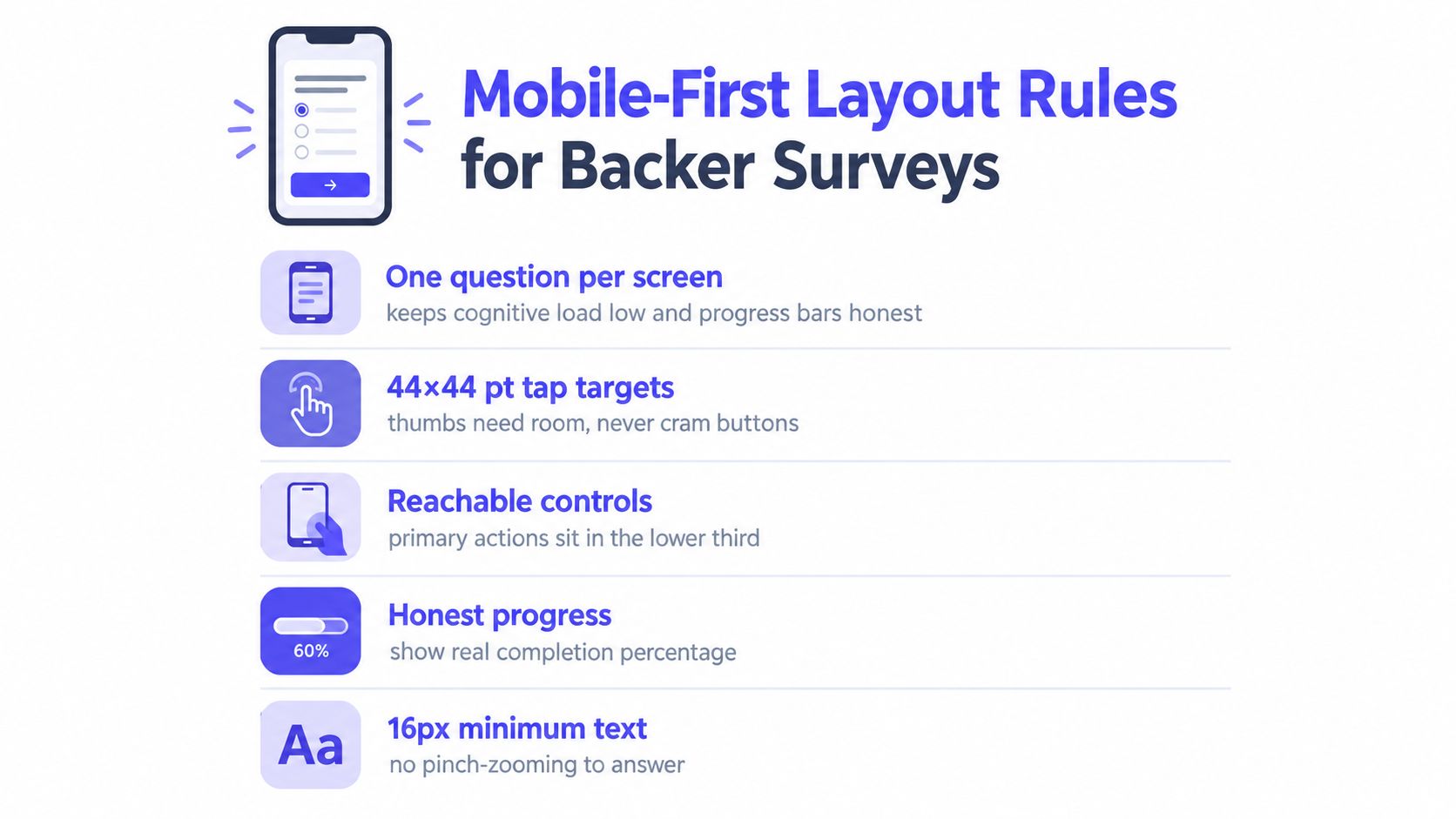
Keep primary controls in the lower part of the screen, where a thumb naturally rests. Use a large “Continue” button that names the next action, plus a visible back control. Save-and-resume behavior matters when a backer switches apps or loses connectivity, because progress should not disappear after an interruption.
Present reward choices as large tiles with readable imagery, the variant name, and any price difference visible before selection. Avoid small checkboxes beside similar SKUs. A mistaken choice can become a fulfillment exception that remains hidden until packing.
Address capture deserves its own design. Request the country first, then show the fields that apply to that country. Separate street, city, region, and postal code into logical inputs instead of one dense block. Use the correct keyboard for email, postal-code, and free-text fields, and test autofill on real devices.
Large images, autoplay media, and unnecessary scripts make a survey feel unreliable on a mobile connection. Compress reward thumbnails without removing the information needed for selection. The PledgeBox guidance on page-load speed optimization explains why every extra asset competes with the action you want the backer to take.
Text should remain readable without zooming. Use concise labels, strong contrast, and clear spacing between controls. A mobile-first survey is a purpose-built completion path, not a desktop form that merely resizes. That distinction affects completion, upgrade conversion, and the quality of fulfillment data your team receives.
Question order shapes whether a backer experiences the survey as a quick confirmation or another administrative task. Start with an easy decision that confirms momentum. Reward selection, variant confirmation, or a simple color choice usually feels lighter than an address or payment form.
Put identity and reward context before the operational friction. The backer should see what they selected and understand why the next questions matter. Once that context is clear, request the shipping address while the order is already mentally active.
Keep optional commercial decisions after the required information is underway, but don't bury them at the final confirmation. The best position depends on the flow, yet the principle is consistent: don't force a backer to choose an add-on before they know which reward they're completing. A relevant upgrade feels useful after confirmation. It feels like a toll when it interrupts basic order setup.
A practical sequence often looks like this:
Don't trap people in loops. Optional questions need a visible “Skip” or “Continue without adding” action. PledgeBox's survey skip-logic guidance is useful when different rewards need different fields, because conditional logic should remove irrelevant work rather than create hidden gates.
Use progress indicators carefully. They should reflect the actual flow, not promise that the backer is nearly done when several conditional screens remain. A short, honest sequence builds confidence. A misleading progress bar makes the next screen feel like an unexpected demand.
End with a review screen that shows the complete order. Backers should see the selected reward, variants, extras, shipping, taxes, and total in one readable summary. A final review catches mistakes before fulfillment does.
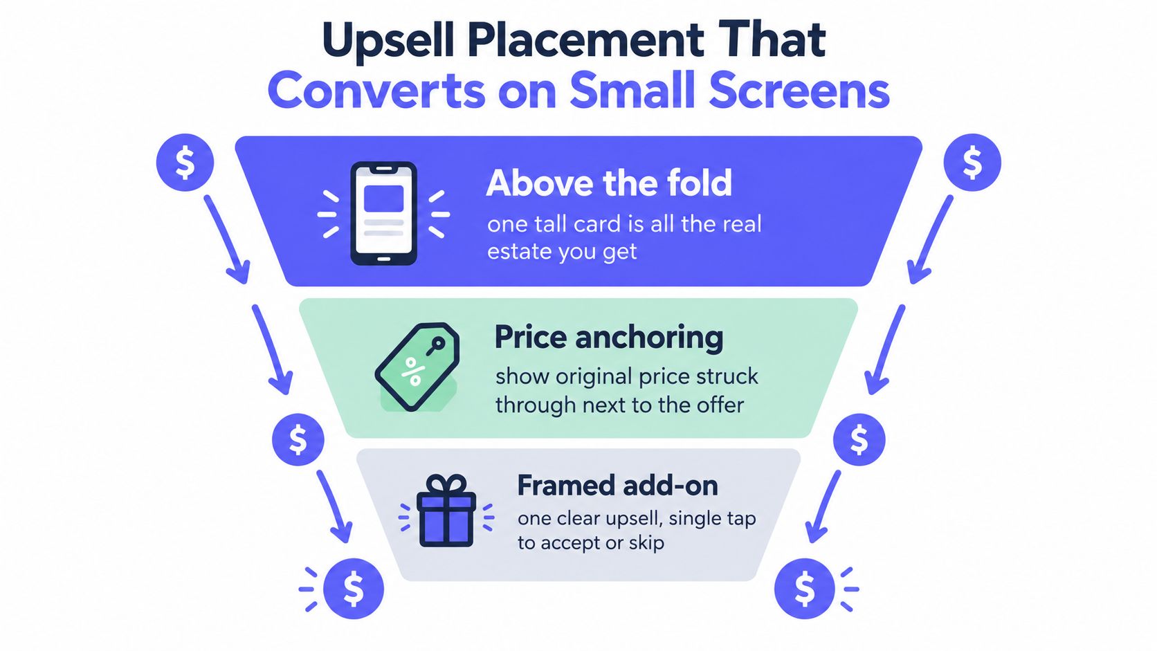
Upsell placement is a revenue decision, not a decorative block added after the survey is finished. On a phone, the first view often gives you room for one strong card. That card must explain the value, show the price clearly, and offer an obvious accept or skip action.
Start with the add-on most closely related to the confirmed reward. If a backer has selected a core product, present a compatible bundle or meaningful upgrade before unrelated extras. The connection reduces interpretation work. A backer shouldn't have to understand your entire product catalog to decide whether one offer belongs with the order.
Price framing also matters. Show the current add-on price beside the original price when that comparison is truthful and operationally supported. Keep the offer self-contained, with the value, price difference, and inclusion details on the same screen. Avoid forcing a backer to open another page to understand what they're buying.
The flow should become lighter as it moves deeper. After the primary offer, smaller extras such as accessories, replacement parts, warranty coverage, or gift packaging can appear as optional choices. Each screen should have one primary CTA and a clear skip path. Several competing buttons create hesitation and increase the chance that the backer leaves without completing the required survey.
PledgeBox is free to send the backer survey and only charges 3% of upsell if there's any. That pricing structure gives creators a practical way to test a lower-friction survey entry while keeping the platform fee tied to confirmed add-on revenue. The survey itself shouldn't feel like a paid gate to the backer, and the creator shouldn't need to add friction just to justify launching it.
That model also clarifies how to judge an upsell screen. If the offer doesn't convert, ask whether the problem is relevance, placement, price clarity, or effort. Don't respond by adding more products. A crowded mobile screen usually makes the decision harder.
Use analytics to distinguish a weak offer from a broken step. If backers reach the offer but skip it, the value proposition may need work. If they abandon before the offer, inspect the preceding address, login, or validation screen. If they accept but later generate fulfillment exceptions, the offer selector may be too ambiguous.
The strongest upsell experience respects the original pledge. It confirms what the backer already bought, presents one useful next option, and makes declining safe. Revenue comes from relevance and clarity, not pressure.
The two platforms represent different operating philosophies. Kickstarter's pledge manager is like Amazon, a marketplace-style experience where backers expect familiar retail interactions and where the broader Kickstarter environment supports discovery. Kickstarter announced in 2026 that its Pledge Manager would soon send finalized orders directly to Shopify for fulfillment, a concrete sign of movement toward a marketplace-plus-fulfillment integration model, as described in Refiner's coverage of the announcement.
PledgeBox's pledge manager is like Shopify, a configurable commerce layer for creators who want more direct control over the storefront and post-campaign flow. That can include branded survey pages, question order, conditional fields, pricing rules, shipping collection, tax handling, subscriptions, add-ons, and late backer purchasing. PledgeBox is free to send the backer survey and only charges 3% of upsell if there's any.
The trade-off concerns more than brand preference. Marketplace familiarity can reduce hesitation for backers who already understand Kickstarter's environment. Configurability can help a creator match the flow to a complex reward catalog, a multi-region shipping process, or a deliberate upsell strategy. One approach emphasizes familiar marketplace behavior. The other emphasizes creator-controlled commerce.
| Dimension | Kickstarter Pledge Manager | PledgeBox Pledge Manager |
|---|---|---|
| Operating model | Amazon-like marketplace experience | Shopify-like configurable commerce flow |
| Mobile flow | Familiar marketplace-style checkout | Creator-configured survey and checkout path |
| Fulfillment direction | Finalized orders can be sent directly to Shopify for fulfillment as announced for 2026 | Supports shipping workflows, downloadable reports, and vendor exports |
| Creator control | More tied to the platform's marketplace experience | More control over branding, sequencing, logic, and pricing |
| Survey cost model | Use the platform's applicable transaction structure | Free to send the survey, with 3% charged only on upsell sales |
| Best fit | Campaigns prioritizing marketplace familiarity | Campaigns needing tailored post-campaign operations |
The right choice depends on the failure you most need to prevent. If backers need a familiar retail environment, the marketplace model may be easier to introduce. If your main problem is variant complexity, custom logic, margin recovery, or brand consistency, a configurable flow deserves serious consideration. The detailed comparison of PledgeBox and Kickstarter's pledge managers can help map those requirements before you send the first survey.
A desktop preview can hide the failure that costs an order. Test the full survey on a current iPhone, an Android device, and an older budget phone. Check iOS Safari and Android Chrome, then repeat the main paths in portrait and in the horizontal orientation. A backer who cannot finish on their actual device is a lost fulfillment record and a missed upsell opportunity.
Run scenarios that reflect the orders your campaign will receive: a simple reward, a reward with variants, an international address, a skipped upsell, and an order that triggers conditional questions. Confirm that each path reaches a valid completion state. Check that an answer cannot produce a blank, contradictory, or impossible next screen.
Use this pre-launch pass:
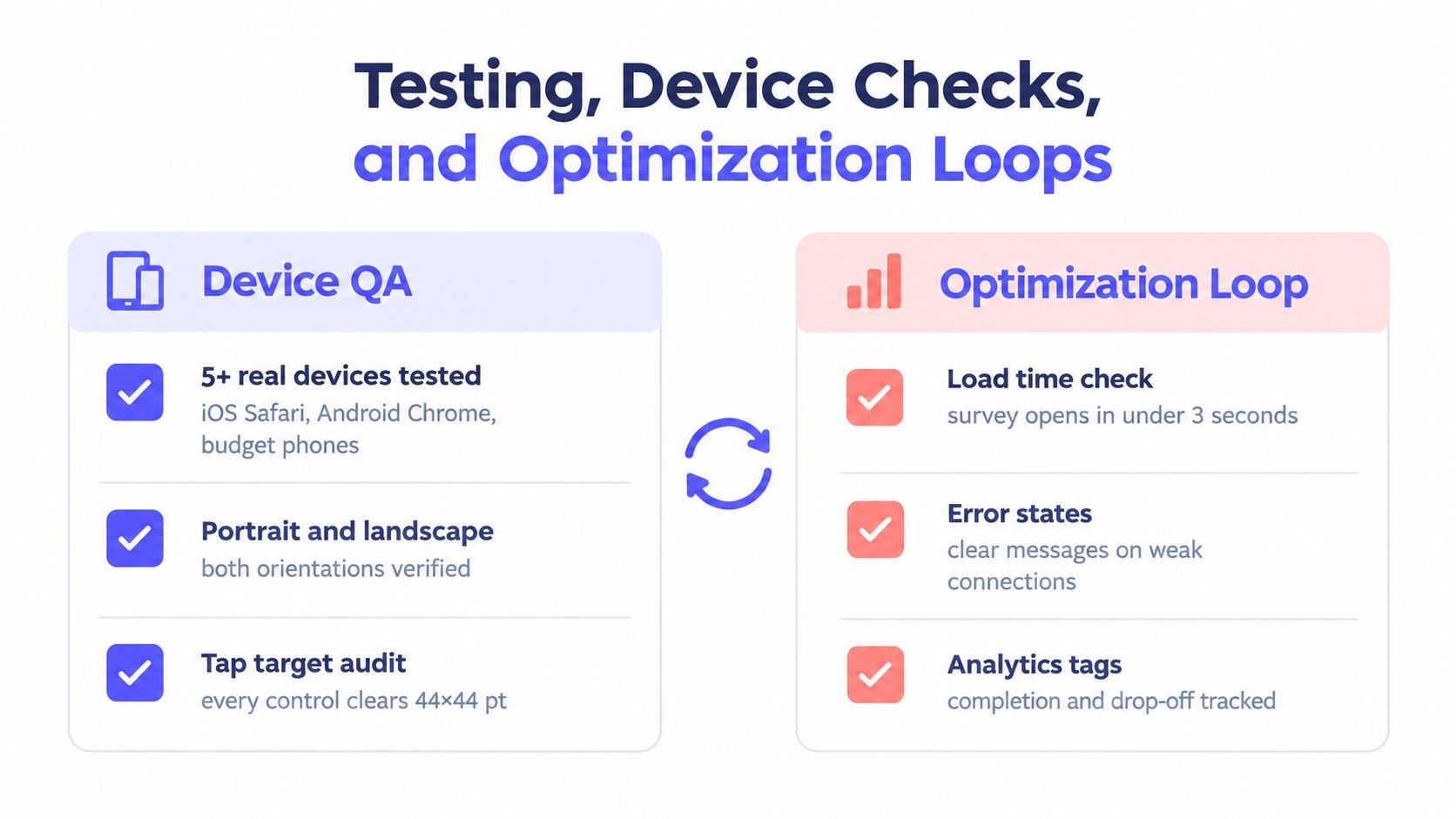
The infographic links device QA with optimization. Track completion and drop-off at each step, not only the final completion rate. SurveyMonkey's mobile survey guidance also supports testing across phones, tablets, browsers, orientations, and operating systems, with accessibility checks that let assistive-technology users complete the flow.
Copy completed responses before changing logic or offer placement. Apply revisions to unfinished backers only. Do not send people who already submitted accurate records through the survey again, because duplicate responses can create conflicting fulfillment data and weaken trust.
Review the flow throughout the post-campaign window. Change one meaningful variable at a time, such as offer order, copy, imagery, or required-field grouping. Compare each version with your own baseline. Keep changes that improve completion, add-on acceptance, or record accuracy without increasing support work.
That discipline turns testing into a revenue control. Faster completion protects the original order, while cleaner records reduce corrections that can erase the margin from an upsell.
The day before release, freeze new features and inspect the decisions that affect revenue and fulfillment. A short, verified flow is safer than an impressive survey with branches nobody has tested. Check the screens that determine whether a backer completes the order, accepts an add-on, or creates a support ticket.
Use the launch checklist as a measurement map:
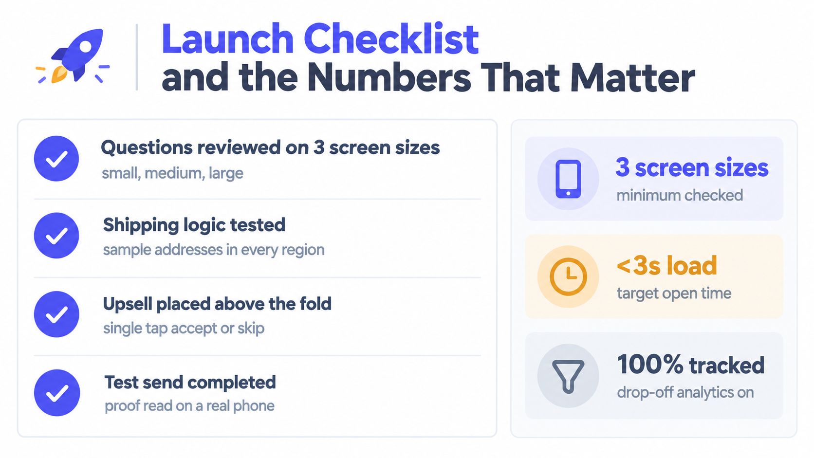
Accessibility belongs in the launch check, not a later cleanup sprint. Remove unnecessary timers, and verify that backers using assistive technology can complete the full flow, including shipping, payment, and confirmation. SurveyMonkey's accessibility guidance for mobile surveys covers the broader mobile accessibility considerations; this final pass should confirm that the actual survey works from start to finish.
Keep the commercial risk visible. The backer survey is free to send, and PledgeBox charges 3% only on upsell sales if there's any. Testing time therefore belongs on the screens that influence completed orders, add-on acceptance, and fulfillment accuracy. A small layout change can affect revenue, while a missing shipping rule can create corrections that consume it.
A good mobile survey produces more than a response. It leaves your team with a clean fulfillment record, a transparent order total, a measured upsell path, and a backer who knows what happens next.
PledgeBox gives crowdfunding teams a configurable, mobile-friendly pledge manager for backer surveys, shipping and tax collection, add-ons, late backer orders, and fulfillment exports. Send your survey for free and pay only 3% on upsell sales if there's any, then visit PledgeBox to build a post-campaign flow designed for completion and accurate fulfillment.
PledgeBox
The All-in-One Toolkit to Launch, Manage & Scale Your Kickstarter / Indiegogo Campaign