The 11 must-have to build a perfect Kickstarter page
A checklist to help You build the best Kickstarter page.

A checklist to help You build the best Kickstarter page.
Among the "perks" of doing my job, I get to see a lot of different crowdfunding pages every day, sometimes it's great and sometimes I see odd choices to say the least.
It seemed to me that some project creators are underestimating the power of building an efficient page, that's why I wanted to summarize in this article what I think makes a great Kickstarter project page and what you might want to avoid doing.
For a starters (and as promised in the over-selling title of this article), let's review the main elements you might want to pay attention to, while structuring your page.
This list is not necessarily in priority order as you'll see that some elements may be prioritized on a case-by-case basis. The hierarchy should be set depending on the importance of an element, best selling points should always be on top:
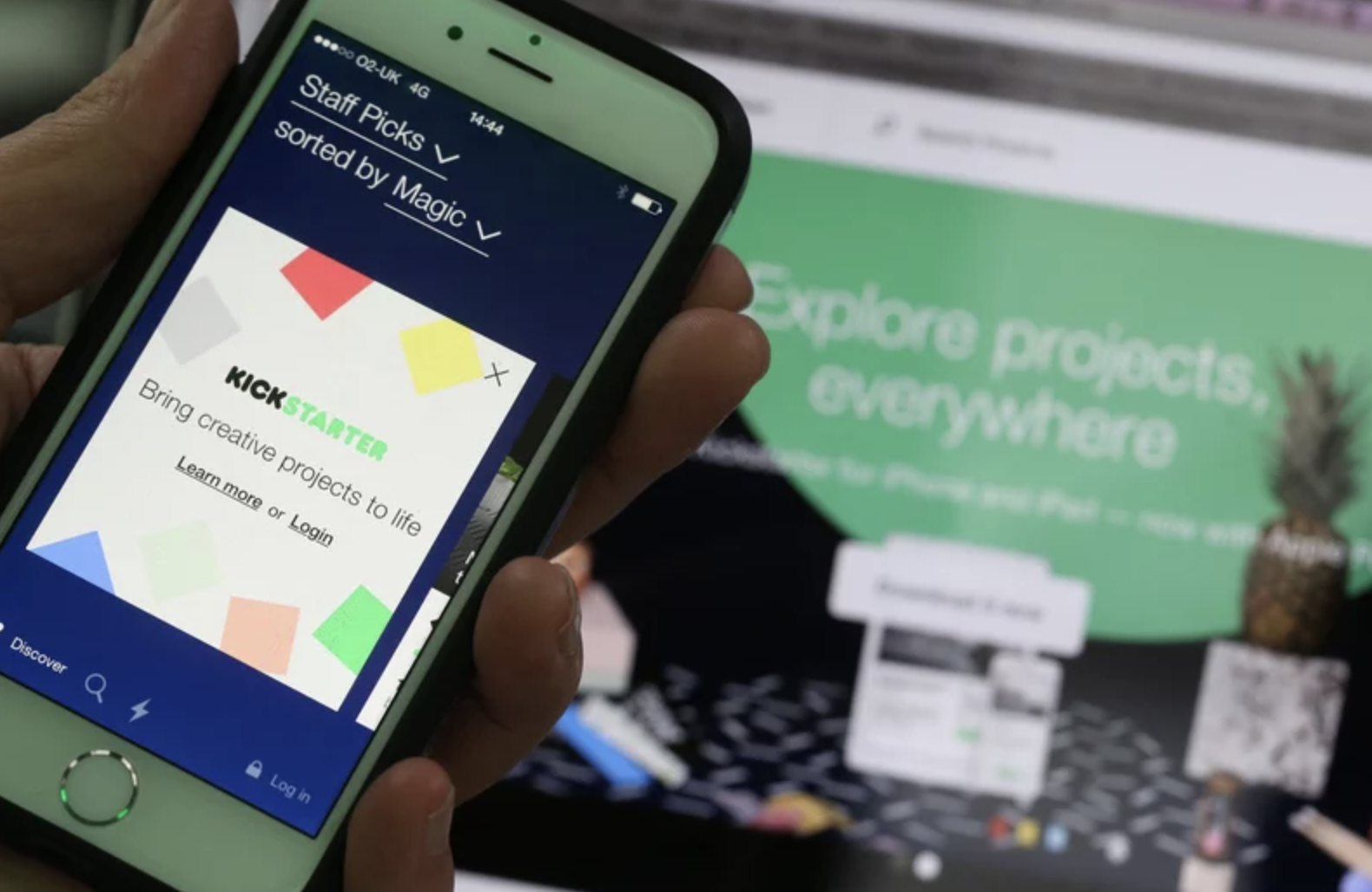
Further down in this article, I'll tell you how important it is to invest in your graphics, let's say that the project image being the first thing backers will see (it's the image you see before clicking to launch the video), it's the most important of the most important, and thus the one you really have to think through.
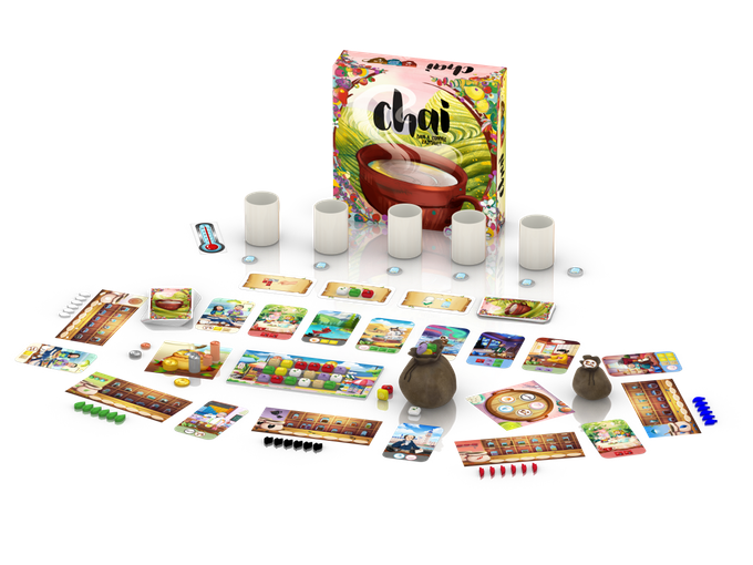
The project images that really attracts me personally are the one where I actually get to see the product. It can be a 3D or an actual photo, in any case it should be very easy to understand at a glance and this image will be also used in a smaller format on the projects lists on the other Kickstarter pages.
Note: this image can be changed all along the way through the campaign and even after, so it's a great place to advertise info that can bring some additional attention to your project during the campaign. You should keep it roughly the same though, to remain consistent.
Here, you have only a few lines to express yourself about your project. It's just under the top video and lets you give information about what you project if about. You have only 3 lines, so be concise, yet very descriptive.
Note: Project description is going to be the meta description of your project on Google, so you definitely have to add some keywords.
Kicktraq is a website that gives a lot of statistics insight about your Kickstarter page. It's funny to look at and very sharable, returning kickstarter backers use that a lot and it actually drives some new backers along the way as Kicktraq features projects on the main page. That's an additional way for new backers to discover your project.
I'm seeing more and more campaigns clearly putting the link at the very top of the page asking backers to upvote on Kicktraq. It makes sense because it helps the project to be on top of the "Hot List" (Top 10 being also on the main page) and it's really really easy for backers to do that.
People want to know what they'll actually receive, make an exhaustive list of the content and/or list the main features. Use graphics to the maximum here.
If Oprah Winfrey says that your product is the best she ever tried, this quote should definitely be on top of the page.
In any case, put some reviews from trustworthy sources. If backers get the feeling that experts from your sector or opinion-leading people think your product is great, every single other line of your project page will have this nice credibility varnish.
Potential backers want to understand why they have to pledge your project and why they have to do it now.
You want to tell them why your project is unique and I would recommend giving reasons your project stands out form the crowd, because it surely does. I would suggest laying down the 10-20 reasons your project is unique and keep the to 3-6 to put on the page.
Next, you don't want backers to think that they might as well wait after the campaign is finished to get your product. It's crutial that that you creat a strong incentive for them to back now. List the reasons that makes your backers' support absolutely essential, for the project to see the light and reward your backers with unique features that only them would benefit from. I listed a few of the common incentives for backers to actually back:
This could be the subject of an entire blog post, so I'm not going to be exhaustive there, making stretch goal is a good motivational tool for your backers to help you putting the word out about your campaign.
SG (Stretch goals) has to be seen as mini-campaigns, each of those has to bring value to your backers and thus be easily sharable.
To summarize, SG are an incentive you give to backers to reach a milestone. Theycan be either social based (number of backers, shares on twitter, funny videos, etc.) or money based (basically the amount you raised), or even both, it's potentialy a long debate and again depends on your product.
I'm really going to keep that for another article as I have too much to say here.
You know the statement that says that an image is worth a thousand words, a 5' video has 7200 images, it's 7 200 000 words... Try writing that much words and maybe you'll convince yourself that shooting a video to further explain your product is a bargain.
I just made up a rule, it's called "The dollar shave club rule", take a look at this (non-Kickstarter) video on Youtube, it's the recipe of a great intro-video :
While the main video has to be short and efficient, you should make another (or several other) video(s) that goes in details through the many features of your product. Here, you don't need to make a Hollywood movie (keep your budget for the main video James Cameron), a decent quality smartphone-shot video is fine as long as the content really brings some new info to the backer and helps to better understand the product.
This mostly depends of your product and your overall strategy. One the one hand, it's a good way to increase the average basket, but on the other hand it's also a source of logistical complication (and I know about logistics, and complication).
Truth is; you'll makes mistakes, everybody does... every-time. Don't tell people that you know what you are doing and thus risks are 0.0001%, because while I'm sure you know what you are doing, risks always exist and some of those you don't control.
You ask for people to invest even before you started to manufacture and even if you have worked with your manufacturer for the last 5 years and nothing ever got wrong (I doubt it Pinocchio), even if your entire design is top notch and got the NASA seal of approval, your always can have your container fall into the sea on the way to the warehouse.
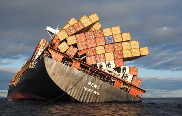
So, be true to your backers, remind yourself of each step you will go through and tell them what could possibly go wrong and delay the delivery of the rewards. You won't scare anyone off, you'll bring trust on yourself as being a reliable human being (or team), that know where his is going.
Note: The Risks and Challenges section is mandatory and can only be written in plain-text.
You might think that it's not part of the page structure, but I would strongly advise to have a reminder of the pledge levels of your main page so people can get a visual idea of what they would get as a reward.
Regarding the actual reward levels on the right section of your page, same as the rest of the page, best is to keep the information concise. I might do a specific article about reward levels in the future, for now I'd say that the rewards have to be easily understood and easy to differentiate from each other. Prefer listing the unique aspect of each reward level and keep the recurring elements for the main page.
1. Be passionate
Believe it or not, Kickstarter is still about making a creator's dream come true and backers want to feel that you made this project with your heart.
Show that you love your project and that it reflects who you are. The page can't be just about this but should have touches of yourself here and there.
2. Get great designer/artist/photograph
Of course you might be starting a crowdfunding campaign because you can't afford the development on the game without the help of the community, but competition in tough on Kickstarter now and if you don't put the necessary efforts, your potential backers will simply arbitrate toward choosing another project to back.
You still can find great help without spending too much money ahead of your campaign, here is a few ideas:
I mean very widely. I was talking with a creator at Essen Spiel (a very big board games fair in Germany) and he told me that, for a new campaign, they were finishing up the page 1 month ahead of the planed date and then sharing the preview link not only to the close ones and specialized Facebook groups, but to their entire community. It's a genius move because:
1. Typo and syntax mistakes
Hey, again, we all do mistakes, I will have this article proof-read by at least 2 person before publishing it and it's not even a Kickstarter page.
Find someone who spots any mistake in a sentence (your mom for instance), have a maximum people read you page before publishing, don't under-estimate the negative-power of typos and bad syntax.
If you make some typo on your page, I will immediately assume that you'll make mistakes while creating your product and so will most of the backers, that's a serious drawback.
2. Bad design
Don't get your brother-in-law make the graphics because you are having hell of a deal with him. Invest in your page, make some wireframes and work with a pro-designer, a pro-photographer, a pro-3D artist or a pro-illustrator (or the 4 at the same time if needed) to showcase your product the best possible way.
3. Only text/too much info
You don't want your page to look like a Wikipedia page, you know why? Simply for the same reason people watch more movies than then read books, human beings prefer images and it's even better when those move.
Most people will spend 30s to 2mn on your KS page before taking a decision (to back or not to back, that's the question) and you want them to get as much information as possible before setting up their mind, so make sure that the text is short and easy to read and replace text by images, videos or even gifs when you can.
If a lot needs to be said about your project anyways, the best is to use external links and FAQ. A rulebook for a board game, detailed specs for an electronic device, those elements might be important to less than 5% of the backers to make a decision, so it shouldn't be put on the main page. Again, be concise, you already have a lot to say.
I now believe you have the basics, don't hesitate to send us an email if you think that I'm missing something in the list or if you have questions.
The All-in-One Toolkit to Launch, Manage & Scale Your Kickstarter / Indiegogo Campaign